google sheets pivot table slicers

How to Make a Pivot Table in Google Sheets with Slicers

Google Sheets has come a long way in being a formidable alternative to Excel. While it may not have all of the same features as Excel, Google is adding to its functionality. Creating a pivot table with slicers is now a possibility in Google Sheets, and below, I’ll show you how you can do that with the online spreadsheeting program.

The basics: creating a pivot table in Google Sheets

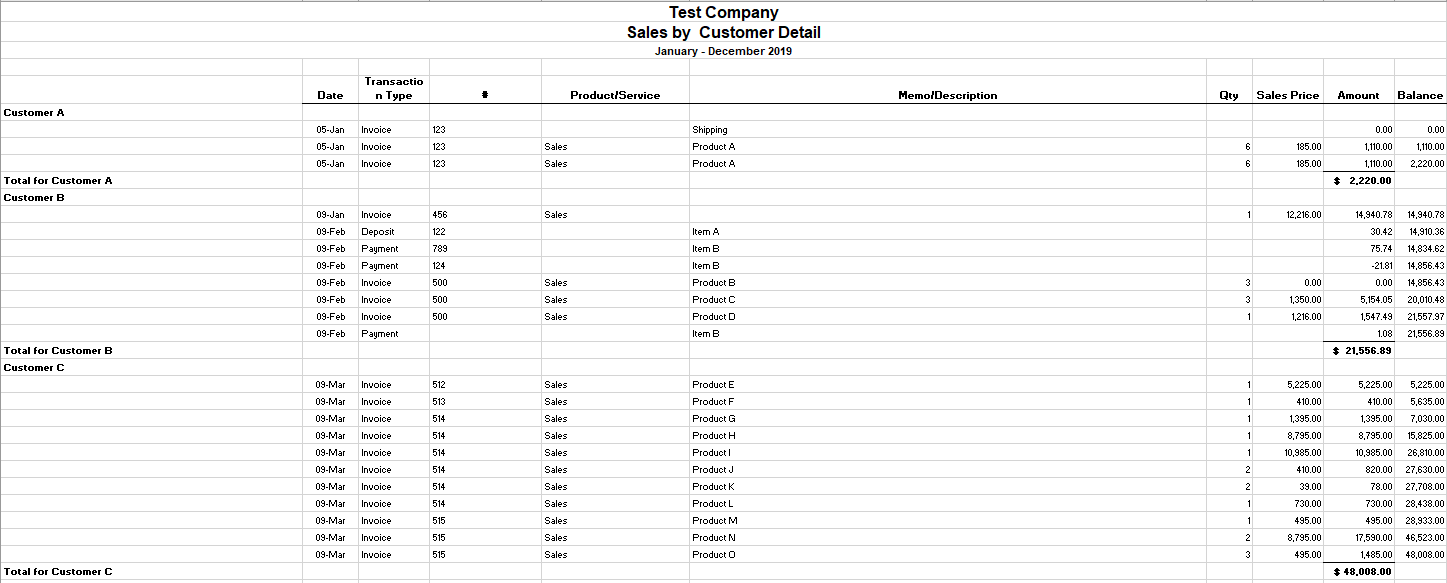
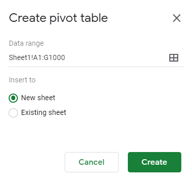
To create a pivot table in Google Sheets involves about the same steps as it does in Excel: compiling and organizing your data set, and then creating the pivot table. Here’s a quick look of my sample data that I have ready to use:

spreadsheet data in google sheets

Then, on the Data menu, select the option to create Pivot Table:

creating a pivot table in google sheets

The next step is selecting where you to put your pivot table:

Menu to select where to create the new pivot table.

The default, a new worksheet, will often work the best. Although the layout looks a little different, the process remains the same with a blank pivot table being your starting point:

new pivot table created in google sheets

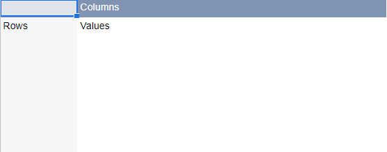
On the right-hand side of the page, you’ll see options to put fields into columns and rows, which is what you’re used to with Excel. Again, the main difference is the layout but the logic remains the same:

adding fields to a pivot table in google sheets

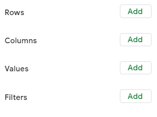
When clicking on the Add button, you’ll see options as to which fields to add, even having the option for a calculated field as well:

Adding a field to the values section of a pivot table on google sheets.

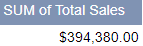
In my example, I’m going to select Total Sales so that I can summarize my data based on sales:

sales total pivot table

Next up, let’s add fields for both the row and column sections of the pivot table. If you have a lot of dates in your data set, you’ll want to put the field into the Row section. Otherwise, Google Sheets may give you an error where there are too many columns.

Even if you want to use dates in the column section, you’ll better of first putting it under Rows. Then, right-click on one of the dates and select Create pivot date group:

Google Sheets create pivot date group

From here, you can group your dates so that you don’t have too many entries. In my example, I’m going to use Month as my breakdown. After that, I can move the Date field back into the Column section:

Google sheets pivot table with column and row data

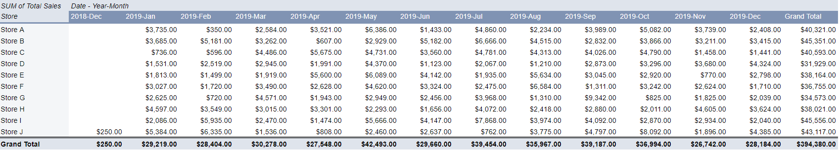
The problem here is that even if you have multiple years, it’ll group it into the same month. For example, I have one entry for Dec. 31, 2018, and it has not separated that out from the 2019 values. In order to fix this, I need to change the grouping from Month to Year-Month. Then my pivot table looks as follows:

Google Sheets pivot table with year month breakdown

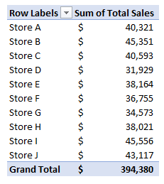
Now the data from December 2018 is broken out. Next up, I’ll add another field for the Row section. Here, I’ll add the Store field. And now my pivot table is looking more like what I’d expect it to:

Google Sheets pivot table row and column data filled in.

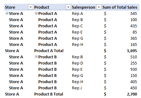
Next, let’s also add the Salesperson field as well so that we have more of a breakdown:

Google Sheets pivot table with multiple columns and rows.

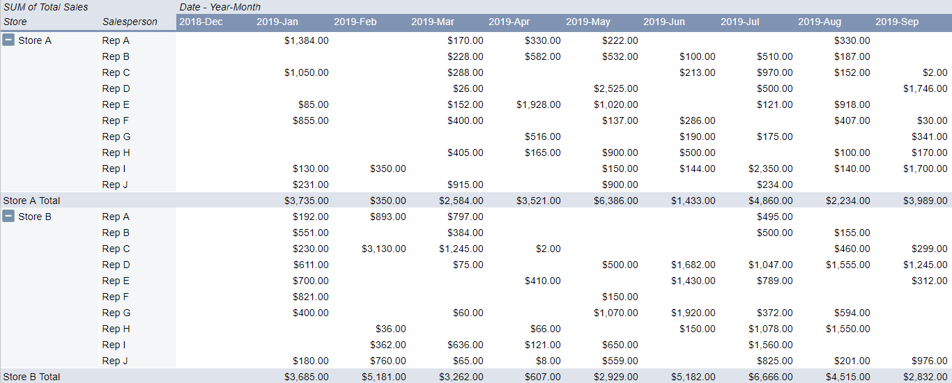
One of the things that stands out right away is that in Google Sheets the layout of the pivot table is much more intuitive. One of the annoyances of pivot tables in Excel is they’re not in a tabular format by default. With Google Sheets, it’s not something you need to worry about.

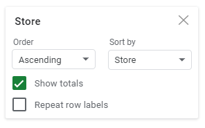
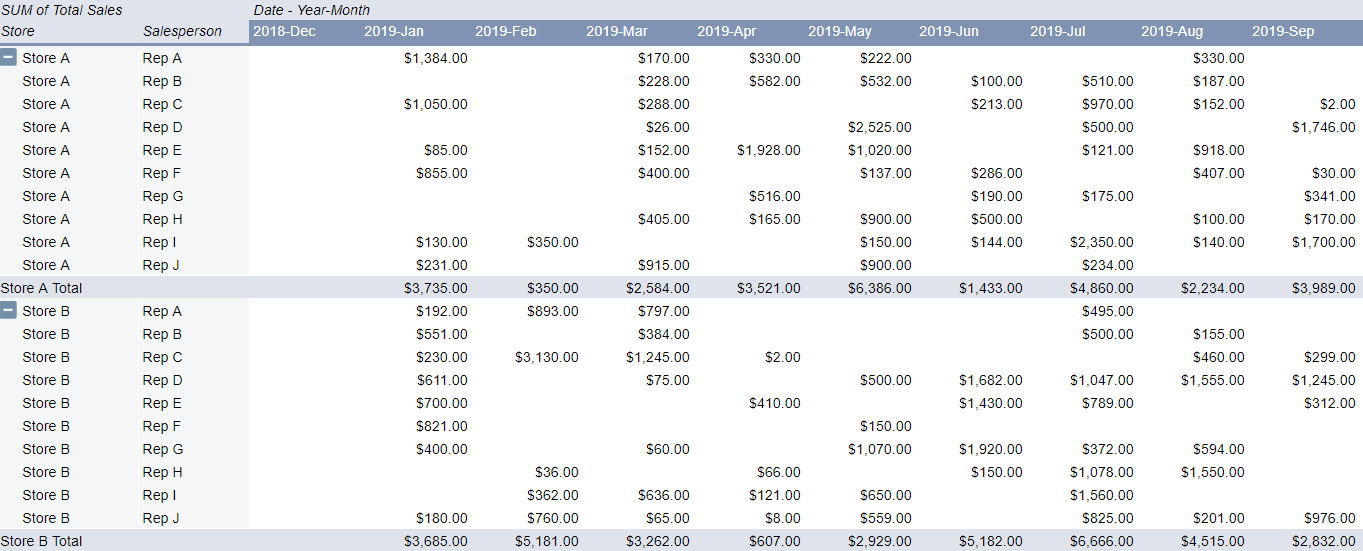
It still doesn’t have the repeating rows for the Store field, but that’s a quick fix: simply click the option to Repeat row labels:

Repeat row labels option in Google Sheets is easily accessible within the field settings.

And then, voila:

google shets pivot table with multiple columns and rows

Just like with a regular pivot table you can also drill down into the individual cells to the detail. In Google Sheets, it also gives you a specific name as to what cell you’ve drilled down on, making it easier to refer back to when looking at many different tabs:

Google Sheets new tab name for drill down pivot table results.

Adding slicers to the pivot table

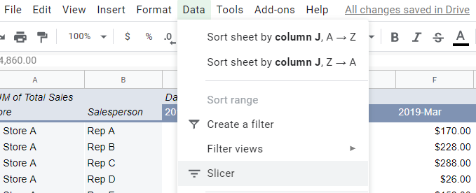
You can also add slicers to your pivot table to make it easier to make changes to it and update it on-the-fly. To add a slicer, just click on the Data tab while you’re on the pivot table and click on Slicer:

adding a slicer to a pivot table in google sheets

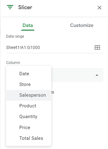
Then that will generate the slicer, where you’ll be prompted to select a column to filter by:

Click on the filter icon and then on the right-hand side you’ll see the option to select a field from a drop-down list. In this example, I’m going to select Salesperson:

adding a slicer to a pivot table in google sheets

Then, on the slicer you can filter by the values in the column:

selecting the values to filter in a slicer in google sheets

If I hit the clear button and select only Rep A, Rep B, and Rep C, this is what my pivot table now looks like:

google sheets pivot table filtered by a slicer

The slicer shows the number of items selected and as you can see, it only has the sales reps that I selected in the data. You can add more slicers for other columns but the process remains the same. The big difference you can see from Excel is that your selections are how you’d make the selections in a normal filter; you don’t have buttons for each slicer option the way you do in Excel.

There are changes that you can make to the font and color of the slicer but other than that, visually, there aren’t many changes to make. So if you’re looking to replicate a similar Excel-type dashboard in Google Sheets with many options available for how slicers look then you may be disappointed here. However, in terms of functionality, the slicers work in much the same way that they do in Excel.

A good start, but Google Sheets is still lacking

Google Sheets still has a ways to go in being a real replacement for Excel. While it does have some unique functions that Excel doesn’t, adding pivot tables and slicers is a significant step forward.

However, one area that still needs more improvement is charting. For instance, creating a chart from the pivot table is not an easy task and doesn’t look like Google Sheets is designed yet to create easy-to-use pivot charts. And until that happens, there’s still going to be a big gap between the type of dashboard you can create with Google Sheets and what you can make in Excel.

The good news is that Google Sheets has made a lot of progress and it’ll likely be even better in the future.


If you liked this post on How to Make a Pivot Table in Google Sheets with Slicers, please give this site a like on Facebook and also be sure to check out some of the many templates that we have available for download. You can also follow us on Twitter and YouTube.

person fixing a computer

This Macro Converts Your QuickBooks Export Into a Table-Friendly Format

QuickBooks does a good job when it comes to recording sales and doing day-to-day accounting tasks. You may be content with the reports that come out of QuickBooks, too. But if you’re looking for some more in-depth analysis to do of your own or to make your own reports, you’re likely going to want to move that data into Excel. And, unfortunately, the QuickBooks export into Excel can be less than optimal.

With many spaces, subtotals, and a non-tabular format, it’s not a very practical output to use in Excel. If you want to run a pivot table and do some serious analysis in Excel, you first have to clean up the data before being able to use it, and that can be a very tedious and tiresome process.

For example, this is what your QuickBooks report might look like when you’re pulling a simple summary of your customer sales:

quickbooks export into excel

There are a lot of things that need to be adjusted for this report to be useable in Excel, including getting rid of the blank spaces and ensuring that the customer information is repeated in the first column, as opposed to just in the first line and in the last line’s total. From afar, it’s a bit of a painful process to have to go in and clean this up. And while it’s not impossible, it’s not going to be quick, either.

That’s where a macro can help you make the task much quicker and it will save you a lot of time if you have to go through these steps often. Click the button on the ribbon and your data will convert into a more table-friendly format! Here’s how it works:

Using the macro to fix the QuickBooks export

Before running the macro, you’ll need to specify the columns where your customer names and dates are:

Then, run the Covert Data button:

Excel button to modify data exported from Quickbooks

Downloading the file

The free version of the QuickBooks macro will allow you to run the conversion if it doesn’t go past 100 rows. However, if you decide to purchase the full version please ensure that the macro and file works as expected. There’s no guarantee the QuickBooks export hasn’t changed or won’t change in the future. If there are changes that need to be made to the macro, please feel free to contact me so that I can make the necessary adjustments. Whether you prefer the add-In or the actual Excel spreadsheet itself, both versions are available both here and in the paid version as well.

Here is the download link for the add-in as well as the Excel file. For the paid versions, please visit the product page.

If you have another program or software that you’d like a similar add-in for, I can help with that as well.


If you liked this post, please give this site a like on Facebook and also be sure to check out some of the many templates that we have available for download. You can also follow us on Twitter and YouTube.

rowcolor

How to Alternate Row Color in Excel

Looking at numbers on a plain white spreadsheet can sometimes make it difficult to differentiate one row from another, especially from afar. It can also make the spreadsheet look a bit bland. That’s why in this post I’ll show you how in Excel you can alternate the color of both rows and columns.

The first step is to create a new conditional formatting rule in Excel

Ultimately, all you need to alternate the row color in an Excel spreadsheet is a little bit of conditional formatting. It just comes down to getting the logic and the formula right in ensuring that the correct rows are highlighted.

To get things started, select Conditional Formatting from the Home Tab and then Create New Rule

home tab excel selecting new rule from conditional formatting menu

Once there, you’ll want to select the option to Use a formula to determine which cells to format:

selecting a formula for conditional formatting in excel

This is where we’ll now enter the formula that we’ll want to use for the alternating rows.

Use the MOD function along with ROW to determine which row to apply a different color to

The key function that we’ll need to use is the MOD function. What this function does is it tells us what the remainder is after a number has been divided by a divisor. This is important because what we need the conditional formatting to do is to evaluate each individual row to tell us whether it is an odd or even number, and the MOD function allows us to do that.

For example, the following formula will return a value of 0:

=MOD(6,2)

Since two divided by six will return a result of three and have no remainder, the result of the formula is 0. If, however, we change the formula to this:

=MOD(6,4)

The formula will now return a value of two, since four only goes into six one time, leaving a remainder of two.

Now, it’s simply a matter of applying this logic to each row. To do this, we need to incorporate the ROW function into our formula as well. The end formula is actually not very complex:

=MOD(ROW(),2)=0

The above formula will be true if the row is an even number, and thus, any conditional formatting we have set for that rule will apply. If we wanted to modify every odd row, then the formula could be tweaked as follows:

=MOD(ROW(),2)=1

You could have two sets of rules, one for odd rows and one for evens, but that’s really not necessary. Instead, you can simply select all the rows and then apply the formatting you want for the even rows, and then create a conditional formatting rule for the odd rows. This way, the formatting you apply to the entire sheet will be overwritten by the conditional formatting rules for the odd rows anyway and your original formatting will end up applying only to the even ones.

Applying a different color to the different rows

Once you’ve created your rule, then it’s just a matter of selecting the formatting you want to use and how you want to highlight the rows. I’d suggest a color that is light so that you don’t have too much contrast. This is how my Excel spreadsheet looks after applying a light blue color to every alternate row. I’ve left the default formatting in place for the odd rows.

conditional formatting alternating rows highlighted

If your spreadsheet doesn’t look like this, check to make sure that you have applied the conditional formatting to the entire sheet and that it isn’t only to a select few rows or cells. If you’re unsure about this, refer back to my earlier post on conditional formatting to help give you a better idea of how it works.

You can highlight alternate columns in a different color too

As you may have guessed, the same logic and conditional formatting rules that we used above can be applied to columns as well. Instead of the ROW function we just need to use the COLUMN function in our formula. That’s really the only difference as the formula will look nearly identical:

=MOD(COLUMN(),2)=1

You’ll follow the same steps as far as creating a new conditional formatting rule, but the process is largely the same. The one thing that you’ll notice, however, is that if you have both rules in place, your conditional formatting has now overlapped:

conditional formatting overlap for both columns and rows in blue

In the above example, the formatting is the same color, but if they were different, the overlap would stand out even more. And that’s where it may take some experimenting with different formats to ensure that you get the right overlap and that the different formatting rules blend well together. Assuming, of course, that you want both rules in place.

Other options to alternate the row and column color in Excel

While this post showed you how to change colors for odd and even rows and columns, you can certainly extend that logic even further. For instance, you could decide to highlight every third row by changing the MOD function so that you’re dividing by three rather than two. As long as the logic is sound, you can modify these formulas so that they alternate the rows that you want.

For example, if you wanted to alternate the color of every fifth row and every 13th row on your Excel spreadsheet, you could create one conditional formatting rule to apply to every fifth row and then another for every 13th one as well. Although putting this into one larger formula is possible, it would a bit cleaner to put them into different rules.

When it comes to conditional formatting, there’s a lot of flexibility in how you can structure how your spreadsheet works. However, you also don’t want to get too carried away and make the spreadsheet too colorful and difficult to read. Otherwise, it may end up defeating the purpose and making your spreadsheet less user-friendly.


If you liked this post on How to Alternate Row Color in Excel, please give this site a like on Facebook and also be sure to check out some of the many templates that we have available for download. You can also follow us on Twitter and YouTube.

12-Month Calendar

Excel 12 Month Calendar Template

There are many Excel calendars online but with this template, you can customize it to suit your needs and use the calendar for more than just one year.

At a minimum, you can use the template to help generate a 12-month calendar for a specific year. However, it can do a whole lot more than that. If you want to use it for a custom fiscal year, you can use a different start date. You can also use custom accounting periods based on weeks, whether it’s the 4-4-5, 4-5-4, or 5-4-4. It can help make a template that will fit all of those needs.

And on top of that, you can also highlight holidays and deadlines on the calendar to make it easy to keep track of all your important dates.

How the template works

There are two tabs on the calendar template: calendar and setup. The only area to enter data is on the setup tab, and that’s where you will select the details relating to how you want your calendar to display.

variables to setup in the excel 12-month calendar template

The first item that you’ll want to enter is the start of the fiscal year. If you just want a regular calendar, then you can leave this as January 1. However, you’ll want to enter the year that you want the calendar for as well. This is the only cell where you’ll specify both the year for the calendar and the first day of the calendar as well.

On the following field, you can toggle between whether your week starts on Sunday or Monday. This will just impact how the calendar looks and will have no effect on anything else in the template.

If you just need a regular 12-month calendar, that’s all you need. If, however, you’re looking for a more customized format that accommodates a varying week schedule, then you will want to enter an ‘X’ in the Custom Quarterly Format field. If you do not enter an ‘X’ here, then the following values will be ignored and won’t have a bearing on the calendar.

The next three fields relate to how many weeks each period has. If you have fiscal periods that follow the 4-4-5 pattern where the third month of each quarter is a 5-week month, then you would enter ‘4’ for period 1 and period 2, and ‘5’ for period 3.

Those are all the variables that will relate to the structure of the calendar itself. You can go a bit further, however, and enter in holidays and other important dates as well.

Entering holidays and other dates

In column G you can enter the holidays or non-working days that you observe. Any dates in this column will be highlighted in yellow on the calendar. Columns H and I serve the same purpose, and that’s to highlight any important dates or deadlines. In column H, the dates will be highlighted in red while the ones in column I will be in green.

12-month calendar with holidays and important dates highlighted

There’s no restriction on what you can enter in these columns and these deadlines could be annual or monthly. You could even use various date functions to help create recurring deadlines here as well.

You can enter dates in for the entire column so they don’t even need to be for the current year. This is why you can reuse this template for future years, as you can just adjust the starting date for the year and update the holidays, and the template will automatically update based on what you have entered.

Download the 12-month excel calendar template

This template contains no macros and is free to use. You can download it here. It does have some ads and the calendar tab is locked to ensure nothing isn’t overwritten by accident. There is also an ad-free version available here that is completely unlocked. As always, I encourage you to always try the free version first to ensure it works how you expect it to and that it’s what you’re looking for.

Looking for a full-month calendar template?

This template is for a 12-month snapshot but if you’re looking for one that focuses on an individual month and that can allow you to enter tasks and deadlines, be sure to check out this template. It will give you even more options for managing your monthly tasks and deadlines.

And if you’re looking for a personal calendar that will help you manage different goals at once, then this goal tracker template could be what you’re looking for. But if you’re looking for something completely different, feel free to contact me and make a suggestion. I am always looking for new ideas and templates to add to the site.


If you liked this 12 Month Calendar Template, please give this site a like on Facebook and also be sure to check out some of the many templates that we have available for download. You can also follow us on Twitter and YouTube.

TFSATemplate

Free TFSA Contribution Tracker Spreadsheet for Canadians (2025 Update)

What is a tax-free savings account (TFSA)?

A tax-free savings account (TFSA) is a very useful tool for Canadian investors to shield investment gains and dividend income from taxes. However, it can be challenging to keep track of the rules and just how much you’re able to contribute and what your TFSA limit is for the year.

How much can I contribute to my TFSA in 2025?

For 2025, the annual contribution limit for the Tax-Free Savings Account (TFSA) is $7,000. This amount is set by the federal government and can increase over time due to indexation for inflation. If you were at least 18 years old in 2009 (the year the TFSA was introduced) and have never contributed, your total available contribution room as of 2025 would be $102,500. That total includes all annual limits from 2009 through 2025. Your personal contribution room may be lower if you’ve contributed in previous years, or higher if you made withdrawals in earlier years, since withdrawals get added back to your room at the start of the following calendar year.

It’s important to note that unused contribution room carries forward indefinitely, so you don’t lose it if you don’t max out your TFSA each year. This flexibility makes the TFSA one of the most powerful investment vehicles for Canadians, since it allows you to plan contributions around your cash flow without worrying about missing out on available room. To confirm your personal TFSA limit, you should always check your CRA “My Account,” as financial institutions don’t track your overall contribution room across multiple accounts.

Do TFSA withdrawals increase my contribution room?

Yes, TFSA withdrawals do increase your contribution room — but not immediately. Any amount you withdraw from your TFSA is added back to your contribution room starting on January 1 of the following year. For example, if you withdraw $5,000 in 2025, your contribution room for 2026 will increase by $5,000 on top of your regular annual limit. This feature makes the TFSA highly flexible, since it allows you to use the account both for long-term investing and for shorter-term goals where you may need access to your funds.

The key detail to remember is that you cannot re-contribute the withdrawn amount in the same calendar year unless you already have unused room available. Re-contributing too early would result in an over-contribution, which is subject to a penalty tax of 1% per month on the excess. To avoid this, it’s best to track your contributions and withdrawals carefully — or use a TFSA tracker — so you know exactly when that room becomes available again. This rule is one of the most common sources of confusion among Canadians, so understanding the timing is essential to getting the most out of your TFSA.

What happens if I over-contribute to my TFSA?

While it may seem simple to track your balance, there’s one issue that can cause headaches for TFSA holders, and that’s when it comes to withdrawing funds. One of the advantages of a TFSA is that since the funds that are contributed are after-tax, you don’t incur any penalties for taking money out. Unlike with an RRSP, you don’t have to worry about a withholding tax. With a TFSA, you can freely move money in and out of your accounts as you need it.

The caveat, however, is that when you withdraw funds, the contribution room isn’t replenished until the beginning of the next calendar year. And so if your TFSA had been maxed out on July 1st and you had withdrawn $10,000, then that will free up contribution room –- but it won’t be until January 1st. Any withdrawals that are made, regardless of the time of the year, won’t free up space until the beginning of the next calendar year.

That’s where much of the complexity comes into play when it comes to TFSAs. While contributions will reduce your available contribution room immediately, withdrawals won’t make that room available until next year. That lag can create many problems for TFSA holders. That lag can give people the misleading impressing that they have contribution room since they recently took money out, and that’s where overcontributing can happen very easily.

Suppose your TFSA is maxed out (2025 cumulative balance is $102,000) and you pull all the funds out today and they re-contributed them immediately after. In this scenario, you’ve now overcontributed by the entire balance -– meaning you’ll get a 1% penalty on that entire amount, which would amount to $1,020. And that’s just for one month. Leave that overcontribution in your TFSA and those penalties will pile up quickly.

While that may not be a common scenario that will take place, it’s an extreme example that helps to demonstrate just how costly it can be to make a very simple mistake. That’s why simply tracking the balance and looking at contributions and withdrawals is not enough, TFSA holders need to factor in the lag that happens with withdrawals. It’s a small but important detail that can make a big difference in determining how much contribution room you have available.

What this template will help you do

The purpose of this template is to help you keep track of both the contributions you make to your TFSA as well as the withdrawals so that you know what your limit is in a given year. If you’ve got multiple TFSAs and they aren’t all at one financial institution, keeping track of all your transactions can be a challenge. That’s where a spreadsheet can come in very handy; having all your information all in one place can make it much easier to stay on top of your TFSAs.

By logging your transactions each time you make a withdrawal or contribution from one of your TFSAs, you can have a complete picture of your balance at any given time. There’s no limit to the number of transactions you can enter in the template, and this can be used for a running total — forever.  And with no macros and a simple, easy-to-use interface, the goal of this template is to make the process as painless as possible.

Use this template to track your TFSA limit

The template itself is very simple to use. There’s an area to enter any TFSA transactions, and while you can start from your first year of eligibility, if you know the contribution room you have as of the start of a specific year, you can start from there.

In the header, there is a section where you can specify your contribution room and the year. If for example you’re starting 2025 and you know the contribution room you have is $50,000, this is how you’d enter it:

Entering the contribution room and year for the TFSA tracking template.

Upon doing so, the template updates to show the starting room as per that year.

TFSA tracking template showing contribution room by year.

You can, however, start the calculations from your first year of eligibility by selecting from the drop-down list in cell R2:

Selecting the first year of eligibility for a TFSA from a drop-down list.

Next, you can specify any contributions and withdrawals from the TFSA transactions table. If you have multiple TFSA accounts, you can enter the specific one in the account tab. The template will total all of the transactions, making it easy for you to stay on top of your total contributions and withdrawals, regardless of which account they originated from. You can keep adding to the list of transactions as you need to and the table will continue expanding.

TFSA template listing transactions and showing the possible types of transactions to choose from.

All the amounts are to be entered as positive. The type of transaction will ensure that the transaction is put into the correct column and update the balance calculation correctly.

TFSA tracking template with transactions listed.

What if I go over my TFSA limit?

If the value in ending room field goes negative and indicates that you have overcontributed to your TFSA, the amounts will be highlighted in red (see below). That being said, just because it hasn’t highlighted in red doesn’t mean you’re safe. You should use this as a guide and not an absolute indicator of whether you’re okay or not.

TFSA template showing balances and which has highlighted an overcontribution.

Planning makes perfect

Even if you haven’t made any transactions during the year, what you can do is to enter transactions you expect, or plan to make. Especially if you’re expecting to withdraw funds, you’ll want to budget for that in this template to ensure that it won’t cause a problem for you. Doing some planning beforehand can help prevent problems down the road, and save some costly surprises.

Checking your data

One of the most important things that you can do is to verify that your data is correct.

When in doubt, your best bet is to confirm with the CRA. If you have My Account setup for access online, what you can do is access your balance as of the beginning of the year. While it won’t have all the contributions and withdrawals that you have made since the start of the year, you will have information on your available room as of January 1. This will at least give you a number that you can use as a starting point and then after factoring in your transactions, you can determine what your up-to-date balance is.

Downloading the file

As always, if you want to go ahead and try the file out just keep in mind there are no guarantees that come with it and that when in doubt, you should always verify your information with the CRA especially when it comes to determining how much room you still have available.

Here’s the link to download the TFSA template

The template will not factor in penalties and ultimately the accuracy of it will depend on how up to date your recordkeeping is.


The TFSA Contribution Tracker Spreadsheet is completely free of charge with no limitations. If you like it, please give this site a like on Facebook and also be sure to check out many other templates that are available for download. You can also follow us on Twitter and YouTube.

excel-1771393_640

How to Use the New XLOOKUP Function

Forget using VLOOKUP or even INDEX and MATCH, Excel users can now use XLOOKUP!

Knowing how to use VLOOKUP has become almost a basic skill for Excel users. If you’re an intermediate or advanced user, you probably use INDEX & MATCH because of the limitations that are inherent with just using VLOOKUP. Since VLOOKUP can only return values to the right of what the value that you’ve found, it’s a less-than-optimal formula. You can either re-arrange your data, or you can use INDEX & MATCH. It’s a more flexible solution, but it’s also not ideal. After all, you’re now combining multiple Excel functions into one.

Enter: XLOOKUP

XLOOKUP is the solution that Excel users have been looking for…for decades. What the function does is allow you to do what was possible with INDEX & MATCH all in one simple formula.

Let’s go over it with some sample data on the world’s largest cities:

list of the largest cities in the world
Data courtesy of Wikipedia

Doing a regular lookup vs XLOOKUP

Here’s how my formulas would look like if I wanted to return the Country using a value from the City field:

vlookup and index match doing a regular lookup

In the above example, E5 refers to the capital city value. While the INDEX & MATCH combination works, it may not be the easiest for novice users who aren’t comfortable with nesting functions. Here’s how the same calculation would look using XLOOKUP:

xlookup doing a lookup

It’s a much simpler solution. The first argument takes the value you want to look for, followed by the range where you want to search for it, and then the range that you want to extract the corresponding value from. There’s no need to enter a column number the way you do with VLOOKUP, nor is there a need to add another function.

There are optional arguments you can use including how you want to match (see the next section). You can also choose the direction that the lookup goes, in case you don’t want to look in the same order as your data:

xlookup argument to search data

Using wildcards in XLOOKUP

Like with the other functions, you can also incorporate wildcards into XLOOKUP as well. Wildcards work similarly among all three formulas, but the key difference is that XLOOKUP has multiple arguments for its fourth (optional) argument which dictates how you want the data extracted. Entering ‘2’ will tell the function that you want to use a wildcard. Below are the options for the match_mode argument (optional):

  • 0: exact match
  • -1: exact match or next smaller item
  • 1: exact match or next larger item
  • 2: wildcard character match

Here’s a comparison of how you’d get the same result using all three functions using a wildcard:

using wildcards in xlookup vlookup and index match

The logic is the same in the sense that you’ll want to use a wildcard character like * around the term you’re trying to find a match of. In the above example, I used the * around the entire wildcard, and it returned the population for New Delhi in that example.

XLOOKUP here is actually a bit more complicated as with the other functions you didn’t need to specify that you were using a wildcard. Taking out the ‘2’ from the argument would result in XLOOKUP yielding an #N/A error. However, it could be that doing this will make it more efficient.

Finding the closest matches

One of the other options for the matches mentioned above were finding the next smaller or next larger matching items if an exact one wasn’t found. A good example of this is where you’re looking for something like a tax rate where you won’t find every possible income level that someone might enter and you need to ensure that it falls into the correct range.

Here are some sample categories:

sample tax categories and tiers

If I entered an amount of $17,000, it should put me in Tier 3, since that would be the threshold I would have reached under this hierarchy. Here’s an example of how this would be calculated in the three functions:

doing a lookup for tax brackets using xlookup vlookup and index match

All three formulas were able to return the same tier correctly, however, INDEX & MATCH is a bit more cumbersome again due to having multiple functions within it.

The advantage that XLOOKUP has here is that I can select the category that’s either directly below or above the amount I enter, effectively rounding up or down, simply by changing the fourth argument between a ‘1’ (exact or next largest item) to a ‘-1’ (exact or next smallest item).

This is not possible with VLOOKUP, and in order for this to be able to work with INDEX & MATCH, I’d have to change the order from ascending to descending. But what’s impressive is that XLOOKUP is able to find the correct category even if the values are not in any sort of order at all.

Have a look at what happens when I try to completely destroy any sort of hierarchy:

tax brackets sorted into tiers

This is an absolutely dreadful hierarchy that’s not consistent in any way possible. Do the formulas have any chance of getting it right? Here’s how the results looked:

xlookup index and match doing a lookup for next smallest category

Both the INDEX & MATCH as well as the XLOOKUP formulas were looking for the closest matches. INDEX & MATCH returned the lowest tier, which technically was incorrect since $17,000 came in higher than $10,000, which was Tier 2. And XLOOKUP, despite the mess of a hierarchy, was still able to pull out the correct group.

Ultimately, you never want to organize your data in such a horrible way, but this helps demonstrate just how strong XLOOKUP is, to be able to still come out with the correct calculation.

And just for fun, let’s flip the formulas around, this time looking for an exact match or the next largest category:

xlookup index and match doing a lookup for next largest category

There wasn’t a Tier 3 in my incomplete table, but XLOOKUP still found the next largest Tier which was at $25,000 – Tier 5. INDEX & Match found its way into Tier 7.

Creating a dynamic formula

One of the great things about INDEX & MATCH is that you can index an entire database and then dynamically change which column you want to extract from based on a selection and not have to update the range in the formula. For example:

creating a dynamic formula using index match

Why would you want to do this? The beauty of it is that you can change what value you extract based on your selection. Since you’re doing a match, it will look for that field and adjust the column accordingly using the OFFSET function:

You can do this in XLOOKUP as well, and here’s how that formula would compare to index and match:

xlookup index match doing dynamic formulas

The XLOOKUP formula is a bit more complicated as it needs two ranges, and thus, two OFFSET functions are needed. In the INDEX & MATCH combination, only one OFFSET function is needed as it only requires a column number for one of its arguments. Either way, you still need to be familiar with using OFFSET so it’s probably not a dealbreaker if XLOOKUP is a bit longer.

Great, so how do I get XLOOKUP?

There are two things you need to be able to get access to XLOOKUP:

  • Office 365
  • Enrollment in the Office 365 Insiders Program

It’s not an exclusive club or anything, all you have to do is to follow the steps outlined here. By selecting the ‘Insider’ option rather than Monthly, you’ll get more frequent updates and changes. Once you’ve got it set up, then it’s just a matter of waiting for the updates to roll out to you. There’s, unfortunately, no notification, I’d just suggest checking every now and then to see if XLOOKUP shows up in your functions list.

Caveat

One of the things you should remember, however, is that while it may be great to use XLOOKUP, old versions of Excel won’t have access to this flashy new function. And so it’s important to still be familiar with using VLOOKUP and INDEX and MATCH.


If you liked this post on How to Use the New XLOOKUP Function, please give the site a like on Facebook. Also be sure to check out our templates section. You can also follow us on Twitter and YouTube.

invoice.template

Invoice Generator Template

If you need to make an invoice and don’t want to spend money on some overpriced software, you can do so easily in Excel with this template. Not only can you customize it to how you want it to look and feel and produce a professional-looking invoice, but you can also track items, set prices based on customers and even have taxes calculated based on location codes.

Ultimately, it’s up to you how complex or simple you want it to be. Here’s how the template works:

The invoice itself

sample invoice in excel

Whether you want to add a logo, change the colors or add some information to the headers, you can have a lot of control over how your invoice looks. The key thing to remember here, however, is not to add or remove any columns or rows. If you need extra space, stretch out the rows or columns, but don’t add any new ones.

And if you need to move the invoice date and number fields, be sure to move them, not delete them or copy and paste. They’re named ranges and so it is important that they remain intact for the code to still work.

Setting up the invoice template

Before you get started and using the template, what you’ll want to do is to set up some items, customers, locations and rates. Unless you really want to start from scratch every time, which I wouldn’t recommend.

First up, start with the Locations tab. If you’re only selling to one part of the world, then just set up a generic location but you can add as many different ones as you need. This is key for ensuring that the correct tax amount is being calculated per customer.

Next up, go to the Customer tab where you’ll have a list of your different customers, including their addresses and location codes. It’s important to add the location codes first because on the customer tabs the locations are drop-down selections that are derived from the locations tab, this ensures that you only select from a location code that has already been created. This is important to ensure that you aren’t mapping to a location that hasn’t been set up, otherwise, you’ll get an error.

Set up all the customers you need. Then next, move over to the Rate tab. Here, you’ll want to set up your customers from columns F onward. On this tab, you will also create your different items and differentiate between products and services. You can create as many items as you want. There is a rate field (column D) when you specify your default rate.

In the columns for your different customers, you can specify a special rate per customer. For example, in the above example, ITEM-1 has a default price of $50. However, if Company A is selected as a customer, a rate of $25 will be applied. If Company B or C is selected, the default rate of $50 will apply since no special pricing has been made available for those customers.

Putting it all together – creating an invoice using the template

With all that set up, now you can go back to the invoice tab to create your own invoice.

First, start with selecting your customer under the Bill To section. Enter the invoice date and invoice number.

Then, it’s a matter of selecting the items in column D, the date in column E and Quantity in column F (if it’s a service item, the quantity won’t matter, a value of 1 will be assumed). The remaining fields should auto-populate. You can edit everything that is in yellow. Anything not in yellow means that it you should NOT modify it (Note: the actual template will not show this highlighting):

Once everything is good to go, you can click on the Generate Invoice button.

This will do two things:

  1. Create a PDF of the invoice you just created and save it to the location specified, and
  2. It will also add the invoice to the Invoice.List tab. This creates a ledger for you to track all the invoices that have been created. If an invoice number is already on there, it will not allow you to create a duplicate. It’s important that you do not delete the invoice number field if you’re changing the template around.

The Invoice.List tab will log all the relevant data from the invoice. This includes the number, date, when it was saved and by who, which folder, and even individual item sales.

Disclaimer

The goal of this template is to allow you to generate invoices as accurately as possible. It also helps you track all your invoices. However, it’s by no means a perfect solution as you could conceivably alter the data in the Invoice.List tab after the fact. What I’d recommend is password protecting the file or hiding the tab if it will be used by multiple users.

So if you choose to use this file, it’s just important to keep that in mind. By adding too many controls and preventing people from deleting or correcting items, it may end up being too much of a hassle. This template isn’t a substitute for accounting software and it’s intended to create and track invoices.

Please note it’s up to you to ensure that your invoice is accurate and correct. You should always double-check an invoice before sending it out.

Download

The invoice template is free to use although there is a limitation of 3 items per invoice. It will also have an ad in the ribbon. The full version is available here. It will remove the limitations, advertising, and the code for the VBA will be unlocked as well.

If you like this Blank Invoice Template, please give the site a like on Facebook. Also be sure to check out our templates section. You can also follow us on Twitter and YouTube.

big data excel pivot tables getpivotdata

How to Use GetPivotData

For many users, the GETPIVOTDATA function in Excel is a nuisance and people are often looking for how to turn it off, rather than to actually use it. It can be a bit of a clunky formula, to say the least, but it can be very useful once you’ve learned how to use it effectively, which is what I’ll show you to do in this post.

Using GETPIVOTDATA to extract data using a single criterion

I’ll start with a simple pivot table that just shows stores and sales:

If I select the cell that has the sales for Store A, Excel populates the following formula:

=GETPIVOTDATA(“Total Sales”,$B$4,”Store”,”Store A”)

Let’s break down the different parts of this formula:

“Total Sales” is the first argument, and it is the name of the data field that I’m pulling my numbers from.

$B$4 is where my pivot table is located. However, this specific cell doesn’t matter, as long as the range is somewhere on your pivot table. For example, I could use B5 or B6; as long as the cell is located on the pivot table, the result will remain the same. The cell also doesn’t have to be frozen. However, if the range refers to a cell that isn’t on the pivot table, you’ll get a #REF error.

“Store” is the third argument, and it’s the field that relates where the “Store A” item is found, which is the last argument of the formula.

In essence, the GETPIVOTDATA starts with selecting the field you want to pull data from, the second argument pointing to somewhere on the pivot table, and with the third and fourth arguments relating to the relevant criteria. Think of it similarly to how you might use a SUMIFS function where you first specify what you want to sum, and where you can keep adding criteria to it.

If I only used the first two arguments of the GETPIVOTDATA function, it would return the total for the entire pivot table:

=GETPIVOTDATA(“Total Sales”,$B$4).

This would give me a value of 394,380 – which is the total of everything in the pivot table.

Using multiple criteria in the GETPIVOTDATA function

Let’s make this calculation a bit more complex and add both a product field and one for the sales rep as well:

If we want to pull the sales that Rep A had for Product A in Store A, that means we now have three criteria instead of just one. The good news is that all we have to build off the previous formula:

=GETPIVOTDATA(“Total Sales”,$B$4,”Store”,”Store A”)

To follow the pattern, what we’ll want to do is add the field name followed by the item in the field that’s our criteria. That means we need to add the “Product” field followed by “Product A” for the item:

=GETPIVOTDATA(“Total Sales”,$B$4,”Store”,”Store A”,”Product”,”Product A”)

Now, if we want to make it more complex and add Rep A as another filter, then it’s just a matter of adding the “Salesperson” field and “Rep A”:

=GETPIVOTDATA(“Total Sales”,$B$4,”Store”,”Store A”,”Product”,”Product A”, “Salesperson”,”Rep A”)

As you can see, you can add in as many criteria as you like. The key is just making sure that the field names you use match exactly what the fields are called on your pivot table. Otherwise, if the field cannot be found or if it is misspelled, you’ll get a #REF error.

Making the GETPIVOTDATA dynamic

Entering in all these fields is not optimal, and the real value in using GETPIVOTDATA is by being able to make the results dynamic and using variables to do the work for us.

To do this, I’ll set aside cells for both the field names as well as the criteria. Here’s how the new, dynamic formula would look now:

What you’ll notice is the GETPIVOTDATA now has nothing hardcoded that you’d have to change in the formula. Instead, you could change the fields in rows 4 and 5 instead. Let’s breakdown the formula in a bit more detail to see how it works:

=GETPIVOTDATA(TEXT(I7,””),$B$4,I4,I5,J4,J5,K4,K5)

The first argument, TEXT(I7,””), references the Total Sales field in cell I7. The reason I use the TEXT function here is that the value needs to be forced into a text format, and by using “” as the second argument in that function, it will keep everything the same.

The following argument, $B$4 still just has to point to somewhere on the pivot table. Unless you move your pivot table, you won’t need to change this argument.

The following arguments: I4,I5,J4,J5,K4,K5 all relate to the cells that have the field and criteria data. Change the values in those cells and the formula will automatically update, rather than having to fumble around and make changes in the actual formula.

Limitations

There are some important limitations that you should be aware of when using GETPIVOTDATA.

Blank values will cause errors

If in the example above you want to use fewer than three criteria, you’ll have to modify the formula, otherwise, you’ll get a #REF error if you simply clear the variables and make them blank.

Data must be visible

Another important thing to remember: if your pivot field isn’t showing the data, the GETPIVOTDATA won’t be able to use it.

Since I’ve removed the Salesperson field from the pivot table, I can no longer use that as part of the criteria in my GETPIVOTDATA formula, and hence is why there is now a #REF error in my result. Even though it is still in the dataset, GETPIVOTDATA will only be able to extract from information that is visible on your pivot table.

Order is important

The order that the fields show on the pivot table will impact how you can use GETPIVOTDATA. For example, if I have Store, then Product and then Salesperson in my pivot table, I have to take that into account when creating the GETPIVOTDATA formula; I can’t just use GETPIVOTDATA to use criteria from the Store and Salesperson fields and skip over Product. I can, however, pull the totals for Store and Product and then just not include Salesperson, since I’m not following a different hierarchy than what’s shown in the pivot table.

Too many fields will make it difficult to summarize totals at lower levels

The GETPIVOTDATA function can be very particular, especially when it comes to hierarchy. For instance, you won’t be able to total sales by rep for everything in the pivot table if you’ve got the store and product fields shown higher up in the hierarchy; you’ll need to incorporate those fields into your calculation. That means adding all those combinations where the sales rep is found, which isn’t optimal. I can’t just say I want to see the total sales this rep made, forget all the product and store combinations that come above it in the hierarchy. The easiest way would be to simplify the pivot table to remove those fields or make the Salesperson field at the top of the hierarchy, and then it would be possible to do that by just using one criterion.

Why formulas may be a better option

GETPIVOTDATA has its strengths, but as you can see, it also has many weaknesses and limitations. This is where using formulas like SUMIFS can be a lot more useful if you’re comfortable using them. GETPIVOTDATA can be useful for pivot tables that aren’t going to move or change and it could also be a bit quicker than a lookup or other function. If you’ve got a lot of cells that you need to populate, SUMIFS may just end up slowing down your spreadsheet too much, and you may find it easier just having multiple pivot tables with different views instead.

At the end of the day, if you hate GETPIVOTDATA and prefer a simpler approach like just using lookup functions to get your data, this post will show you a simple way to get rid of it when selecting cells on a pivot table.


If you liked this post on How to Use GetPivotData, please give this site a like on Facebook and also be sure to check out some of the many templates that we have available for download. You can also follow us on Twitter and YouTube.

monthly return stocks bar chart stacked

How to Apply Conditional Formatting to a Bar Chart

When using charts, sometimes you’ll want to highlight items differently depending on if they’re positive or negative, or may if they’re above or below a benchmark or average. While you can apply conditional formatting to cells, it’s not as easily done if you want to do the same to a bar chart. There’s no simple way without it involving a manual process. However, the good news is there is a workaround.

I’m going to use data from my 12 most recent stock picks on fool.ca and how they’ve done over the course of the month they were picked:

returns table stocks

If I were to map the above table out in a bar graph, here’s how it would look:

monthly return stocks bar chart

Adding a column to add another series you can format

While the above chart is a good way to illustrate the performance, if I want to adjust the values so that they’re negative if they’re red, what I’ll want to do is add an extra column:

monthly returns table negative

Then it’s just a matter of updating the chart so that the extra column is included, and changing the color of all the items on the negative series to red. This is also where you can apply whatever formatting you want to the specific series, and hence, conditionally format the results:

monthly returns table bar chart negative

Make sure you’re using a stacked chart

The one thing that looks off in the above chart is that the red numbers are on the right-hand side and the blue (positive) numbers are off to the left. To fix this, I’m gonna the chart type to a stacked chart. Then my chart looks like this:

monthly returns bar chart negative

That looks a bit better and is more what I was hoping to achieve.

However, I can even take this a bit further and add more columns. As long as it’s in a stacked chart and only one number is filled in for a column, you can have a lot more customization.

Adding a column for above-average results to add more conditional formatting

What I can do to help further differentiate the results is to create a column for above-average returns. To do this, I’ll add another column. I could do an if calculation to see if the number was greater than the average of 6.65%. You can have as many columns as you need to help get the number of groups you need. For example, you might have one column for the return, then a separate column for each group that you want to classify the numbers in. In this example, I just used three columns:

monthly returns negative average

Note that what’s key here is that an amount only shows up in one of the three columns. If there’s any overlap, you’ll have multiple colors per item and then that will defeat the purpose of having only one color.

Below is what the chart looks like now, with bright green showing above average, red being negative, and anything else being light green:

monthly returns negative bar chart average

Although conditional formatting isn’t very intuitive when it comes to a bar chart, there are ways around it that you can make it work.


If you liked this post on How to Apply Conditional Formatting to a Bar Chart, please give this site a like on Facebook and also be sure to check out some of the many templates that we have available for download. You can also follow us on Twitter and YouTube.

wallet-2292428_640

Paying Off Debt vs Adding to Savings: Analysis in Excel

Excel is a great tool for financial questions and analysis, and one popular one is whether someone is better off paying down their debt vs adding to their savings. There are temptations to both, but this is where Excel can help identify a clear winner.

As much as it is a math question, it’s also a question about opportunity cost. If you’re paying down debt then you’ll incur fewer interest charges, and if you add to your savings then you can earn more in interest income. While both options will put someone in a better financial position, that doesn’t mean that one option isn’t better than the other.

Adding to Savings

Typically, banks pay interest rates of around 1% at best, unless there’s a promotional period. But generally, you aren’t making much when it comes to your savings. However, if you’ve got an amount of $5,000 to add to your savings, then that will produce an extra $50 per year at a 1% interest rate, or about $4.17 per month. It’s by no means huge, but it’s still incremental income that can help grow your savings over time.

Paying down debt

If you’ve got credit card debt, however, you’re probably paying anywhere from 15% to 20% in interest. There are exceptions, but most credit cards will likely fall within that range. On a credit card with an interest rate of 20%, that’s going to be an annual interest charge of $1,000 on a $5,000 balance. And so by paying down off a card at that rate, you’ll be saving a lot in expenses.

Difference in interest rates is key

It’s pretty clear that it all comes down to the difference in interest rates, and that’s why paying down debt will always provide you with more of a benefit than adding extra cash to your savings will. While it might be tempting to add to your savings, the reality is that you’ll likely be losing in the long run.

Using a color scale in Excel, I mapped out the difference in interest rates by the size of the possible payment. It’s a very linear relationship: the higher the differential and the higher the payment, the more money you’ll lose by putting money into savings rather than paying off debt:

In the example above, the difference in interest rates was 19% (20% in credit card rate less the 1% in savings rate). Multiplied by a $5,000 payment, that would have resulted in an annual loss of $950. Rather than avoiding $1,000 in interest charges, I would have made just $50 in interest income ($1,000 – $50 = $950 opportunity cost). On the matrix above, you’ll notice this is also the amount that is at the intersection of 19% and $5,000.

Summary

This isn’t the most groundbreaking discovery but it’s one that can be visualized well using Excel. After all, this is a numbers problem, nothing else. While some people may argue there are other reasons to add to savings such as having cash for a rainy day, the reality is that whether you add to your savings or free up room on your credit card, you can access funds from either option. And in the meantime, if you add to savings, you’re still incurring the interest charges. To make matters worse, the interest income you earn may be subject to income taxes, which will further erode the benefit of adding money to savings. Interest expenses on credit cards likely won’t be tax-deductible.

Overall, there really isn’t a strong argument for contributing to savings instead of paying down debt. It’s comes down to what interest rate you’re paying vs what rate you’re earning. And I’ve yet to see anyone earn more in interest than they’ve had to pay on a credit card.

The post is not a substitute for financial advice and is only intended to show how an analysis in Excel can be done when comparing two different options – in this case, paying down debt vs contributing to savings.

You can download the file that I used in these calculations here.


If you liked this analysis on Paying Off Debt vs Adding to Savings, please give this site a like on Facebook and also be sure to check out some of the many templates that we have available for download. You can also follow us on Twitter and YouTube.