pocket watch sand

How to Calculate Time Difference in Excel

If you need to keep track of time entries, whether for a timesheet or some other purposes, it’s important you know how to calculate time differences in Excel, and that’s what I’ll show you how to do in this post. If you’re just looking for the difference in dates, including months, days, or years, then refer to this post. But if you need time differences, keep reading.

Entering time correctly

In order for the difference in time to be calculated correctly, it should ideally be entered in the right format to start with. Let’s use the example calculating the hours worked for a regular 9-to-5 shift.

You can use a 24-hour clock or AM/PM to enter time. If you’re using AM/PM, then you’ll want to make sure you enter a space between the time and the AM/PM indicator. For example: 9:00 AM rather than 9:00AM.

If you enter it correctly, then the value you just entered should align to the right. This means that Excel has interpreted it as time. You can also tell because in Excel it will show as 9:00:00 AM in the cell details. Normally, you aren’t going to enter seconds but Excel will track those extra zeroes anyway.

If you were to just enter 9AM then you’ll notice after hitting enter that nothing happens and Excel doesn’t align it to the right side of the cell. This means that what you’ve entered Excel is reading as text.

That is a problem because if you want to calculate the time difference correctly, it’ll get a whole lot more complex and require using IF and MID functions. It’s not impossible (and I’ll show you how to do so later on), but it will make it a lot more complicated.

Calculating the time difference

Now that you’ve made sure that the time entries are entered correctly, it’s time to show you how to calculate time difference in Excel. Here’s how it looks if I just take the end time and subtract the start time:

calculating time difference for am pm and 24-hour time

If you’re using the 24-hour clock then it looks okay. However, the calculations are still reading in the time format and while that may work okay for the 24-hour clock, it’s going to cause an issue for the AM/PM. So let’s change the format using the comma style so it doesn’t read like a date. Then, the data looks as follows:

calculating time difference for am pm and 24-hour time

This might seem even more confusing until you realize what Excel is doing. It’s assigning a value between 0 and 1 for the time of day. The value of 0.33 indicates that the time is one-third of the day, which is what an eight-hour shift would be since 8/24 is the same as 1/3.

However, using 0.33 isn’t going to be too helpful if you need hours to be able to track how much someone should earn for that shift. To solve this, simply multiply the time difference by 24. Then, your time difference looks as follows:

calculating time difference for am pm and 24-hour time and converting into hours.

Now you see the eight hours that you may have first expected to see when calculating the difference between these times. Since it’s now reading as a number, you can multiply this by an hourly rate and arrive at the pay that is owing for the shift.

If you’re not looking for hours and just want the total minutes, then all you need to do is just multiply by a factor of 60 to convert the eight hours into 480 minutes.

Calculating hours worked when someone works the night shift

The above calculations work well if someone is working within the same day, but if someone starts at 9:00 PM and ends at 5:00 AM the next day, it’s not going to calculate properly if you simply take the difference between the numbers. In fact, the number would come out negative:

calculating time difference for am pm and 24-hour time and converting into hours.

That’s obviously not what you’ll want. To account for this, you’ll need to add an IF statement into our formula. The IF function should look at whether the end time is earlier than the start time. If it is, you’ll want to add 1 to the calculation. Here’s how the formula for the difference calculation would look like:

adjusting time calculations for overnight shifts.

I include the 24 in the calculation so that I don’t need to use an extra cell to convert the difference into hours. All the formula is doing is looking at if the end time is before the start time, and if it is, add a 1 to the end time before subtracting the start time from it. This method will work whether you’re using a 24-hour clock or the AM/PM format:

calculating time difference for am pm and 24-hour time and converting into hours.

This method will work even if someone works a 16-hour shift:

calculating time difference for am pm and 24-hour time and converting into hours.

Knowing how to calculate time difference in Excel isn’t difficult, and the key points to remember are as follows:

  1. Ensure the time is entered correctly, and
  2. Multiply the difference between the times by a factor of 24 for hours and another factor of 60 if you only want minutes.

Calculating time difference in Excel when the data is in text

If you need to know how to calculate time difference in Excel and you don’t have the luxury of the data being in the right format, the good news is it’s still possible to do so.

For instance, what if you want to enter the entire start and end times within one cell. In that case, you’re always going to be running into this situation. Suppose someone enters the following value into a cell: 9:00 AM-5:00 PM.

The format would be correct if there weren’t multiple times in that cell, which ensures it will read as text. That’s where you’ll need to use some data manipulation that involves using the MID function.

Let’s start by pulling the start time. For this, we’ll grab the numbers that come before “AM” but because it doesn’t matter whether it’s AM or PM, we’ll search for the letter “M” on its own:

=MID(A1,1,FIND(“M”,A1,1))

Here’s a breakdown of the formula:

  • Argument 1: A1 is the cell we’re looking at.
  • Argument 2: Start pulling from the first character.
  • Argument 3: The length of the text goes up until the letter “M” is found.

The formula will yield a result of 9:00 AM. However, you’ll still need to convert this into a number and you can do this by multiplying the result by 1 or putting it inside the TIMEVALUE formula:

=TIMEVALUE(MID(A1,1,FIND(“M”,A1,1)))

This will now give us a value of 0.375 and it can be used for the calculation. Next up, we’ll calculate the ending time. To do this, we’ll again use the MID function but the key is to start pulling the data after the dash (-) sign:

=MID(A1,FIND(“-“,A1,1)+1,LEN(A1))

This one is a bit more complicated, but let’s look at the different arguments again:

  • Argument 1: Still looking at cell A1.
  • Argument 2: Use the FIND function to get to the position where the dash (-) is at and then add a 1 onto that to ensure we’re starting from where the number begins and not the dash (-).
  • Argument 3: Even though you don’t need the total length of the string, you can use the LEN function to ensure the formula get everything that comes after the dash (-).

Doing this will give us a result of 5:00 PM and by again adding the TIMEVALUE function into it, it will give us a result of 0.7083

=TIMEVALUE(MID(A1,FIND(“-“,A1,1)+1,LEN(A1)))

You can now combine these formulas into one to do the calculation with text:

=TIMEVALUE(MID(A1,FIND(“-“,A1,1)+1,LEN(A1)))-TIMEVALUE(MID(A1,1,FIND(“M”,A1,1)))

This will result in 0.33 for the time difference, which is the correct result. However, with shifts that stretch into the following day, you’ll again run into the issue of how to deal with calculating time. If you don’t have night shifts to worry about, you can stop here.

But if you need to factor them in, then the easiest way to do so is using the AND and IF functions. We’ll want to look at whether the last two characters end in “AM” while also looking at whether “PM” is in the text:

=IF(AND(RIGHT(A1,2)=”AM”,(NOT(ISERROR(FIND(“PM”,A1,1))))),1,0)

Here’s a breakdown of the formula:

  • The first formula inside the AND function looks at the last two characters in the text to see if they equal “AM”
  • The second function looks for the characters “PM” anywhere in the cell. If it’s not found it will result in an error, that is why the formula begins with NOT and ISERRROR; you’ll want to add a 1 if it isn’t causing an error and “PM” is found.
  • If both of the above conditions are met, a value of 1 will be returned. Otherwise it will result in 0. This can now be added to the earlier time calculation formula, added to the end time.

Here’s how the complete formula will look like after adjusting the end time in case there’s a cross over from PM into AM:

=IF(AND(RIGHT(A1,2)=”AM”,(NOT(ISERROR(FIND(“PM”,A1,1))))),1,0)+TIMEVALUE(MID(A1,FIND(“-“,A1,1)+1,LEN(A1)))-TIMEVALUE(MID(A1,1,FIND(“M”,A1,1)))

It’s a messy formula but it is only adding the 1 to the end time if it’s a PM start time and ends in the AM. The only thing left would be to multiply this all by 24 to get the entire shift total in hours:

=24*(IF(AND(RIGHT(A1,2)=”AM”,(NOT(ISERROR(FIND(“PM”,A1,1))))),1,0)+TIMEVALUE(MID(A1,FIND(“-“,A1,1)+1,LEN(A1)))-TIMEVALUE(MID(A1,1,FIND(“M”,A1,1))))

The key thing to note is for this formula to work it’s important to leave a space between AM and PM. For example, if I were to just enter 9:00AM, Excel wouldn’t read that properly and it would result in an error. By leaving a space, it helps with parsing the data out, otherwise the formula would need to be even more complex. If it isn’t in that format, it’s preferable to first clean up the data as opposed to building a very complicated, nested formula using IFs and MIDs.

The above example goes over a few scenarios and obviously you can adjust the MID and other functions as needed based on how your inputs look. Pulling date calculations out from text is possible, it’s just no very pretty.


If you liked this post on how to calculate time difference in Excel, please give this site a like on Facebook and also be sure to check out some of the many templates that we have available for download. You can also follow us on Twitter and YouTube.

google sheets pivot table slicers

How to Make a Pivot Table in Google Sheets with Slicers

Google Sheets has come a long way in being a formidable alternative to Excel. While it may not have all of the same features as Excel, Google is adding to its functionality. Creating a pivot table with slicers is now a possibility in Google Sheets, and below, I’ll show you how you can do that with the online spreadsheeting program.

The basics: creating a pivot table in Google Sheets

To create a pivot table in Google Sheets involves about the same steps as it does in Excel: compiling and organizing your data set, and then creating the pivot table. Here’s a quick look of my sample data that I have ready to use:

spreadsheet data in google sheets

Then, on the Data menu, select the option to create Pivot Table:

creating a pivot table in google sheets

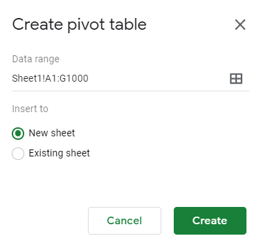
The next step is selecting where you to put your pivot table:

Menu to select where to create the new pivot table.

The default, a new worksheet, will often work the best. Although the layout looks a little different, the process remains the same with a blank pivot table being your starting point:

new pivot table created in google sheets

On the right-hand side of the page, you’ll see options to put fields into columns and rows, which is what you’re used to with Excel. Again, the main difference is the layout but the logic remains the same:

adding fields to a pivot table in google sheets

When clicking on the Add button, you’ll see options as to which fields to add, even having the option for a calculated field as well:

Adding a field to the values section of a pivot table on google sheets.

In my example, I’m going to select Total Sales so that I can summarize my data based on sales:

sales total pivot table

Next up, let’s add fields for both the row and column sections of the pivot table. If you have a lot of dates in your data set, you’ll want to put the field into the Row section. Otherwise, Google Sheets may give you an error where there are too many columns.

Even if you want to use dates in the column section, you’ll better of first putting it under Rows. Then, right-click on one of the dates and select Create pivot date group:

Google Sheets create pivot date group

From here, you can group your dates so that you don’t have too many entries. In my example, I’m going to use Month as my breakdown. After that, I can move the Date field back into the Column section:

Google sheets pivot table with column and row data

The problem here is that even if you have multiple years, it’ll group it into the same month. For example, I have one entry for Dec. 31, 2018, and it has not separated that out from the 2019 values. In order to fix this, I need to change the grouping from Month to Year-Month. Then my pivot table looks as follows:

Google Sheets pivot table with year month breakdown

Now the data from December 2018 is broken out. Next up, I’ll add another field for the Row section. Here, I’ll add the Store field. And now my pivot table is looking more like what I’d expect it to:

Google Sheets pivot table row and column data filled in.

Next, let’s also add the Salesperson field as well so that we have more of a breakdown:

Google Sheets pivot table with multiple columns and rows.

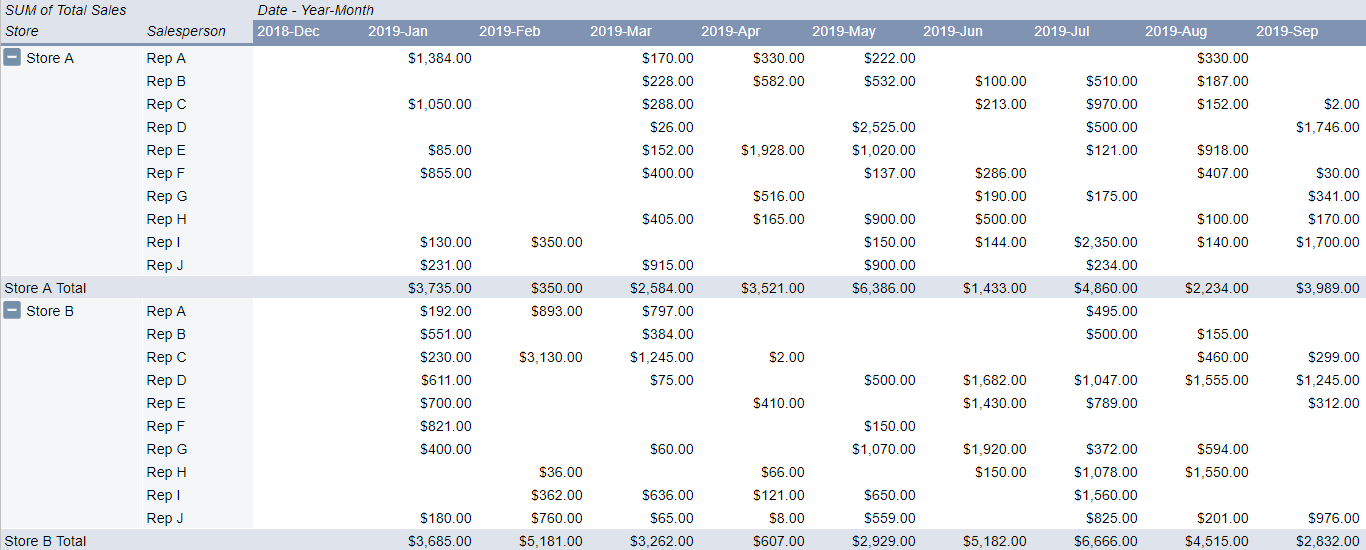
One of the things that stands out right away is that in Google Sheets the layout of the pivot table is much more intuitive. One of the annoyances of pivot tables in Excel is they’re not in a tabular format by default. With Google Sheets, it’s not something you need to worry about.

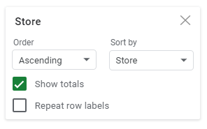
It still doesn’t have the repeating rows for the Store field, but that’s a quick fix: simply click the option to Repeat row labels:

Repeat row labels option in Google Sheets is easily accessible within the field settings.

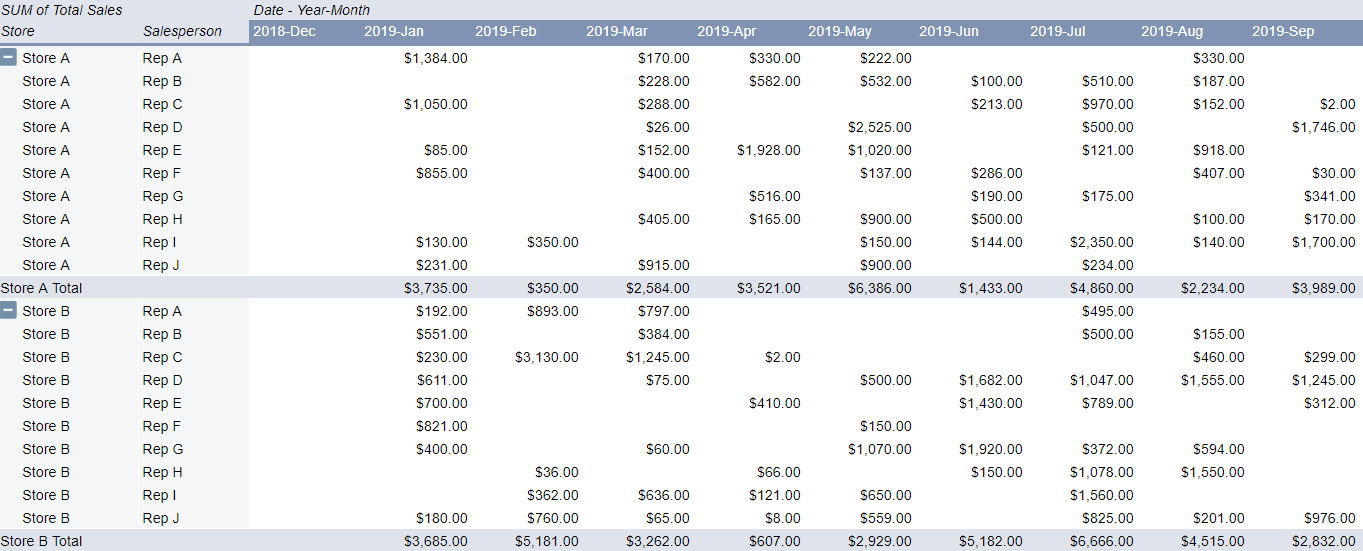
And then, voila:

google shets pivot table with multiple columns and rows

Just like with a regular pivot table you can also drill down into the individual cells to the detail. In Google Sheets, it also gives you a specific name as to what cell you’ve drilled down on, making it easier to refer back to when looking at many different tabs:

Google Sheets new tab name for drill down pivot table results.

Adding slicers to the pivot table

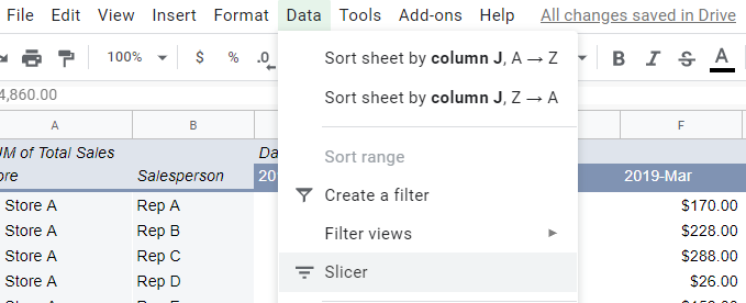
You can also add slicers to your pivot table to make it easier to make changes to it and update it on-the-fly. To add a slicer, just click on the Data tab while you’re on the pivot table and click on Slicer:

adding a slicer to a pivot table in google sheets

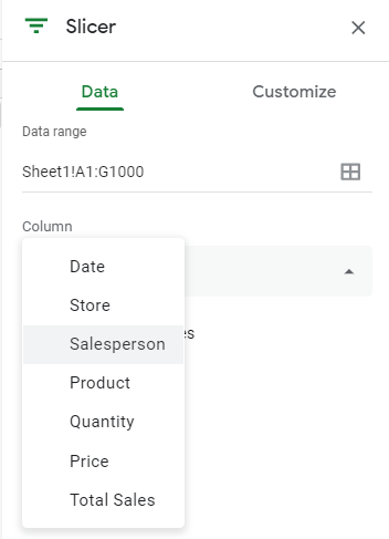
Then that will generate the slicer, where you’ll be prompted to select a column to filter by:

Click on the filter icon and then on the right-hand side you’ll see the option to select a field from a drop-down list. In this example, I’m going to select Salesperson:

adding a slicer to a pivot table in google sheets

Then, on the slicer you can filter by the values in the column:

selecting the values to filter in a slicer in google sheets

If I hit the clear button and select only Rep A, Rep B, and Rep C, this is what my pivot table now looks like:

google sheets pivot table filtered by a slicer

The slicer shows the number of items selected and as you can see, it only has the sales reps that I selected in the data. You can add more slicers for other columns but the process remains the same. The big difference you can see from Excel is that your selections are how you’d make the selections in a normal filter; you don’t have buttons for each slicer option the way you do in Excel.

There are changes that you can make to the font and color of the slicer but other than that, visually, there aren’t many changes to make. So if you’re looking to replicate a similar Excel-type dashboard in Google Sheets with many options available for how slicers look then you may be disappointed here. However, in terms of functionality, the slicers work in much the same way that they do in Excel.

A good start, but Google Sheets is still lacking

Google Sheets still has a ways to go in being a real replacement for Excel. While it does have some unique functions that Excel doesn’t, adding pivot tables and slicers is a significant step forward.

However, one area that still needs more improvement is charting. For instance, creating a chart from the pivot table is not an easy task and doesn’t look like Google Sheets is designed yet to create easy-to-use pivot charts. And until that happens, there’s still going to be a big gap between the type of dashboard you can create with Google Sheets and what you can make in Excel.

The good news is that Google Sheets has made a lot of progress and it’ll likely be even better in the future.


If you liked this post on How to Make a Pivot Table in Google Sheets with Slicers, please give this site a like on Facebook and also be sure to check out some of the many templates that we have available for download. You can also follow us on Twitter and YouTube.

rowcolor

How to Alternate Row Color in Excel

Looking at numbers on a plain white spreadsheet can sometimes make it difficult to differentiate one row from another, especially from afar. It can also make the spreadsheet look a bit bland. That’s why in this post I’ll show you how in Excel you can alternate the color of both rows and columns.

The first step is to create a new conditional formatting rule in Excel

Ultimately, all you need to alternate the row color in an Excel spreadsheet is a little bit of conditional formatting. It just comes down to getting the logic and the formula right in ensuring that the correct rows are highlighted.

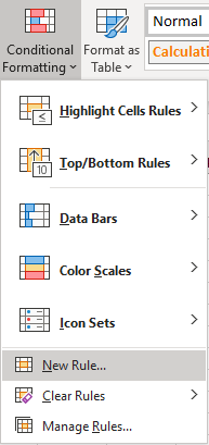
To get things started, select Conditional Formatting from the Home Tab and then Create New Rule

home tab excel selecting new rule from conditional formatting menu

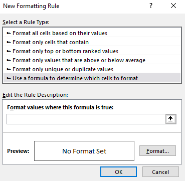
Once there, you’ll want to select the option to Use a formula to determine which cells to format:

selecting a formula for conditional formatting in excel

This is where we’ll now enter the formula that we’ll want to use for the alternating rows.

Use the MOD function along with ROW to determine which row to apply a different color to

The key function that we’ll need to use is the MOD function. What this function does is it tells us what the remainder is after a number has been divided by a divisor. This is important because what we need the conditional formatting to do is to evaluate each individual row to tell us whether it is an odd or even number, and the MOD function allows us to do that.

For example, the following formula will return a value of 0:

=MOD(6,2)

Since two divided by six will return a result of three and have no remainder, the result of the formula is 0. If, however, we change the formula to this:

=MOD(6,4)

The formula will now return a value of two, since four only goes into six one time, leaving a remainder of two.

Now, it’s simply a matter of applying this logic to each row. To do this, we need to incorporate the ROW function into our formula as well. The end formula is actually not very complex:

=MOD(ROW(),2)=0

The above formula will be true if the row is an even number, and thus, any conditional formatting we have set for that rule will apply. If we wanted to modify every odd row, then the formula could be tweaked as follows:

=MOD(ROW(),2)=1

You could have two sets of rules, one for odd rows and one for evens, but that’s really not necessary. Instead, you can simply select all the rows and then apply the formatting you want for the even rows, and then create a conditional formatting rule for the odd rows. This way, the formatting you apply to the entire sheet will be overwritten by the conditional formatting rules for the odd rows anyway and your original formatting will end up applying only to the even ones.

Applying a different color to the different rows

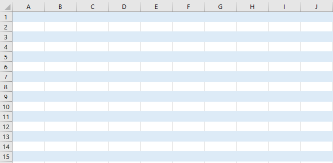
Once you’ve created your rule, then it’s just a matter of selecting the formatting you want to use and how you want to highlight the rows. I’d suggest a color that is light so that you don’t have too much contrast. This is how my Excel spreadsheet looks after applying a light blue color to every alternate row. I’ve left the default formatting in place for the odd rows.

conditional formatting alternating rows highlighted

If your spreadsheet doesn’t look like this, check to make sure that you have applied the conditional formatting to the entire sheet and that it isn’t only to a select few rows or cells. If you’re unsure about this, refer back to my earlier post on conditional formatting to help give you a better idea of how it works.

You can highlight alternate columns in a different color too

As you may have guessed, the same logic and conditional formatting rules that we used above can be applied to columns as well. Instead of the ROW function we just need to use the COLUMN function in our formula. That’s really the only difference as the formula will look nearly identical:

=MOD(COLUMN(),2)=1

You’ll follow the same steps as far as creating a new conditional formatting rule, but the process is largely the same. The one thing that you’ll notice, however, is that if you have both rules in place, your conditional formatting has now overlapped:

conditional formatting overlap for both columns and rows in blue

In the above example, the formatting is the same color, but if they were different, the overlap would stand out even more. And that’s where it may take some experimenting with different formats to ensure that you get the right overlap and that the different formatting rules blend well together. Assuming, of course, that you want both rules in place.

Other options to alternate the row and column color in Excel

While this post showed you how to change colors for odd and even rows and columns, you can certainly extend that logic even further. For instance, you could decide to highlight every third row by changing the MOD function so that you’re dividing by three rather than two. As long as the logic is sound, you can modify these formulas so that they alternate the rows that you want.

For example, if you wanted to alternate the color of every fifth row and every 13th row on your Excel spreadsheet, you could create one conditional formatting rule to apply to every fifth row and then another for every 13th one as well. Although putting this into one larger formula is possible, it would a bit cleaner to put them into different rules.

When it comes to conditional formatting, there’s a lot of flexibility in how you can structure how your spreadsheet works. However, you also don’t want to get too carried away and make the spreadsheet too colorful and difficult to read. Otherwise, it may end up defeating the purpose and making your spreadsheet less user-friendly.


If you liked this post on How to Alternate Row Color in Excel, please give this site a like on Facebook and also be sure to check out some of the many templates that we have available for download. You can also follow us on Twitter and YouTube.

excel-1771393_640

How to Use the New XLOOKUP Function

Forget using VLOOKUP or even INDEX and MATCH, Excel users can now use XLOOKUP!

Knowing how to use VLOOKUP has become almost a basic skill for Excel users. If you’re an intermediate or advanced user, you probably use INDEX & MATCH because of the limitations that are inherent with just using VLOOKUP. Since VLOOKUP can only return values to the right of what the value that you’ve found, it’s a less-than-optimal formula. You can either re-arrange your data, or you can use INDEX & MATCH. It’s a more flexible solution, but it’s also not ideal. After all, you’re now combining multiple Excel functions into one.

Enter: XLOOKUP

XLOOKUP is the solution that Excel users have been looking for…for decades. What the function does is allow you to do what was possible with INDEX & MATCH all in one simple formula.

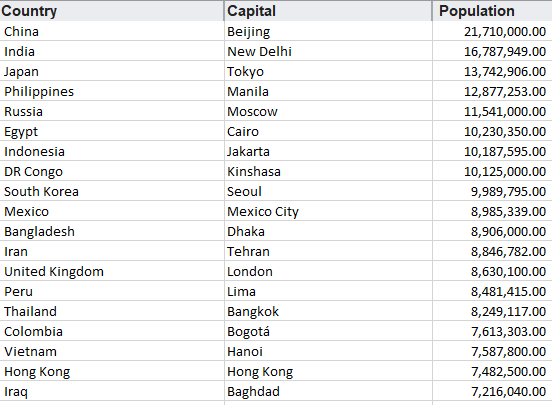
Let’s go over it with some sample data on the world’s largest cities:

list of the largest cities in the world
Data courtesy of Wikipedia

Doing a regular lookup vs XLOOKUP

Here’s how my formulas would look like if I wanted to return the Country using a value from the City field:

vlookup and index match doing a regular lookup

In the above example, E5 refers to the capital city value. While the INDEX & MATCH combination works, it may not be the easiest for novice users who aren’t comfortable with nesting functions. Here’s how the same calculation would look using XLOOKUP:

xlookup doing a lookup

It’s a much simpler solution. The first argument takes the value you want to look for, followed by the range where you want to search for it, and then the range that you want to extract the corresponding value from. There’s no need to enter a column number the way you do with VLOOKUP, nor is there a need to add another function.

There are optional arguments you can use including how you want to match (see the next section). You can also choose the direction that the lookup goes, in case you don’t want to look in the same order as your data:

xlookup argument to search data

Using wildcards in XLOOKUP

Like with the other functions, you can also incorporate wildcards into XLOOKUP as well. Wildcards work similarly among all three formulas, but the key difference is that XLOOKUP has multiple arguments for its fourth (optional) argument which dictates how you want the data extracted. Entering ‘2’ will tell the function that you want to use a wildcard. Below are the options for the match_mode argument (optional):

  • 0: exact match
  • -1: exact match or next smaller item
  • 1: exact match or next larger item
  • 2: wildcard character match

Here’s a comparison of how you’d get the same result using all three functions using a wildcard:

using wildcards in xlookup vlookup and index match

The logic is the same in the sense that you’ll want to use a wildcard character like * around the term you’re trying to find a match of. In the above example, I used the * around the entire wildcard, and it returned the population for New Delhi in that example.

XLOOKUP here is actually a bit more complicated as with the other functions you didn’t need to specify that you were using a wildcard. Taking out the ‘2’ from the argument would result in XLOOKUP yielding an #N/A error. However, it could be that doing this will make it more efficient.

Finding the closest matches

One of the other options for the matches mentioned above were finding the next smaller or next larger matching items if an exact one wasn’t found. A good example of this is where you’re looking for something like a tax rate where you won’t find every possible income level that someone might enter and you need to ensure that it falls into the correct range.

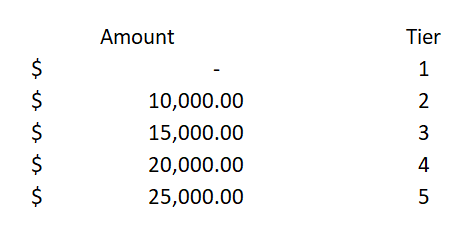
Here are some sample categories:

sample tax categories and tiers

If I entered an amount of $17,000, it should put me in Tier 3, since that would be the threshold I would have reached under this hierarchy. Here’s an example of how this would be calculated in the three functions:

doing a lookup for tax brackets using xlookup vlookup and index match

All three formulas were able to return the same tier correctly, however, INDEX & MATCH is a bit more cumbersome again due to having multiple functions within it.

The advantage that XLOOKUP has here is that I can select the category that’s either directly below or above the amount I enter, effectively rounding up or down, simply by changing the fourth argument between a ‘1’ (exact or next largest item) to a ‘-1’ (exact or next smallest item).

This is not possible with VLOOKUP, and in order for this to be able to work with INDEX & MATCH, I’d have to change the order from ascending to descending. But what’s impressive is that XLOOKUP is able to find the correct category even if the values are not in any sort of order at all.

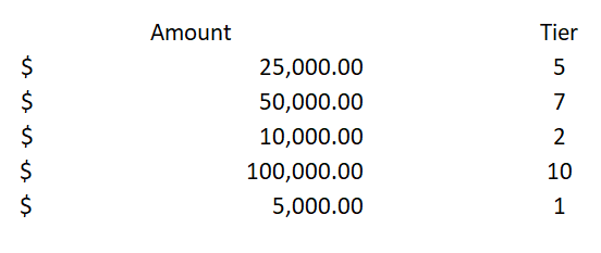
Have a look at what happens when I try to completely destroy any sort of hierarchy:

tax brackets sorted into tiers

This is an absolutely dreadful hierarchy that’s not consistent in any way possible. Do the formulas have any chance of getting it right? Here’s how the results looked:

xlookup index and match doing a lookup for next smallest category

Both the INDEX & MATCH as well as the XLOOKUP formulas were looking for the closest matches. INDEX & MATCH returned the lowest tier, which technically was incorrect since $17,000 came in higher than $10,000, which was Tier 2. And XLOOKUP, despite the mess of a hierarchy, was still able to pull out the correct group.

Ultimately, you never want to organize your data in such a horrible way, but this helps demonstrate just how strong XLOOKUP is, to be able to still come out with the correct calculation.

And just for fun, let’s flip the formulas around, this time looking for an exact match or the next largest category:

xlookup index and match doing a lookup for next largest category

There wasn’t a Tier 3 in my incomplete table, but XLOOKUP still found the next largest Tier which was at $25,000 – Tier 5. INDEX & Match found its way into Tier 7.

Creating a dynamic formula

One of the great things about INDEX & MATCH is that you can index an entire database and then dynamically change which column you want to extract from based on a selection and not have to update the range in the formula. For example:

creating a dynamic formula using index match

Why would you want to do this? The beauty of it is that you can change what value you extract based on your selection. Since you’re doing a match, it will look for that field and adjust the column accordingly using the OFFSET function:

You can do this in XLOOKUP as well, and here’s how that formula would compare to index and match:

xlookup index match doing dynamic formulas

The XLOOKUP formula is a bit more complicated as it needs two ranges, and thus, two OFFSET functions are needed. In the INDEX & MATCH combination, only one OFFSET function is needed as it only requires a column number for one of its arguments. Either way, you still need to be familiar with using OFFSET so it’s probably not a dealbreaker if XLOOKUP is a bit longer.

Great, so how do I get XLOOKUP?

There are two things you need to be able to get access to XLOOKUP:

  • Office 365
  • Enrollment in the Office 365 Insiders Program

It’s not an exclusive club or anything, all you have to do is to follow the steps outlined here. By selecting the ‘Insider’ option rather than Monthly, you’ll get more frequent updates and changes. Once you’ve got it set up, then it’s just a matter of waiting for the updates to roll out to you. There’s, unfortunately, no notification, I’d just suggest checking every now and then to see if XLOOKUP shows up in your functions list.

Caveat

One of the things you should remember, however, is that while it may be great to use XLOOKUP, old versions of Excel won’t have access to this flashy new function. And so it’s important to still be familiar with using VLOOKUP and INDEX and MATCH.


If you liked this post on How to Use the New XLOOKUP Function, please give the site a like on Facebook. Also be sure to check out our templates section. You can also follow us on Twitter and YouTube.

monthly return stocks bar chart stacked

How to Apply Conditional Formatting to a Bar Chart

When using charts, sometimes you’ll want to highlight items differently depending on if they’re positive or negative, or may if they’re above or below a benchmark or average. While you can apply conditional formatting to cells, it’s not as easily done if you want to do the same to a bar chart. There’s no simple way without it involving a manual process. However, the good news is there is a workaround.

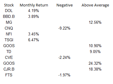
I’m going to use data from my 12 most recent stock picks on fool.ca and how they’ve done over the course of the month they were picked:

returns table stocks

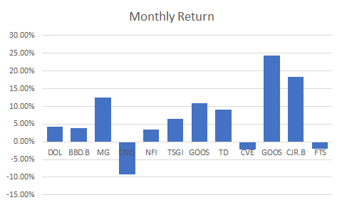
If I were to map the above table out in a bar graph, here’s how it would look:

monthly return stocks bar chart

Adding a column to add another series you can format

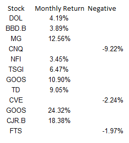
While the above chart is a good way to illustrate the performance, if I want to adjust the values so that they’re negative if they’re red, what I’ll want to do is add an extra column:

monthly returns table negative

Then it’s just a matter of updating the chart so that the extra column is included, and changing the color of all the items on the negative series to red. This is also where you can apply whatever formatting you want to the specific series, and hence, conditionally format the results:

monthly returns table bar chart negative

Make sure you’re using a stacked chart

The one thing that looks off in the above chart is that the red numbers are on the right-hand side and the blue (positive) numbers are off to the left. To fix this, I’m gonna the chart type to a stacked chart. Then my chart looks like this:

monthly returns bar chart negative

That looks a bit better and is more what I was hoping to achieve.

However, I can even take this a bit further and add more columns. As long as it’s in a stacked chart and only one number is filled in for a column, you can have a lot more customization.

Adding a column for above-average results to add more conditional formatting

What I can do to help further differentiate the results is to create a column for above-average returns. To do this, I’ll add another column. I could do an if calculation to see if the number was greater than the average of 6.65%. You can have as many columns as you need to help get the number of groups you need. For example, you might have one column for the return, then a separate column for each group that you want to classify the numbers in. In this example, I just used three columns:

monthly returns negative average

Note that what’s key here is that an amount only shows up in one of the three columns. If there’s any overlap, you’ll have multiple colors per item and then that will defeat the purpose of having only one color.

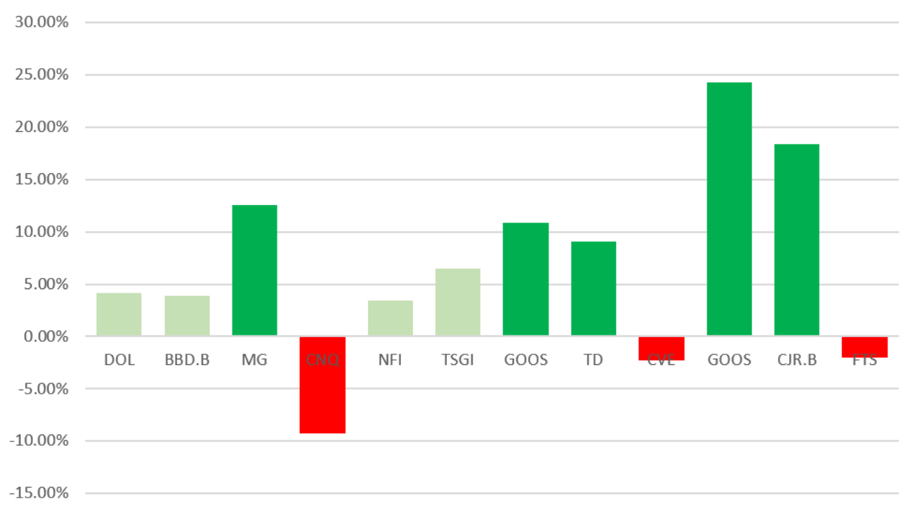
Below is what the chart looks like now, with bright green showing above average, red being negative, and anything else being light green:

monthly returns negative bar chart average

Although conditional formatting isn’t very intuitive when it comes to a bar chart, there are ways around it that you can make it work.


If you liked this post on How to Apply Conditional Formatting to a Bar Chart, please give this site a like on Facebook and also be sure to check out some of the many templates that we have available for download. You can also follow us on Twitter and YouTube.

chart-2785979_640

How to Make a Bar Graph in Excel Using a Formula

Excel has a lot of charts and graphs that you can use to visually show data. However, there’s a way to create a graph using just a simple formula and applying some formatting to it. Below, I’ll show you how to make a bar graph easily without having to worry about legends, axis, or any other chart element you might otherwise need to manipulate.

The key function that makes this all possible is REPT, which just repeats a character a set amount of times. Here’s how it works in practice:

REPT function excel

In the first argument, I specify the character that I want to be repeated. The | symbol, in this case, is repeated five times, which is what the second argument specifies. Right now, this doesn’t look anything like a bar chart, but that’s as easy as changing the font. Here’s how it looks like if the font is set to Britannic Bold and size 11:

rept function excel

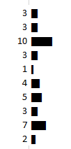
If I had several of these values, I could make it look like a bar chart pretty quickly. Below are some random numbers from 1-10 and how I turned them into a bar chart using the earlier formula:

rept function excel bar graph chart

In the above formulas, I replaced the second argument with the numbers specified above. If an item had the number 10, the | character would be repeated 10 times.

Scaling the bar graph

Now, if you’re dealing with really small or really large numbers, your bar graph could look very skewed. What I’d suggest doing is determining how big you want your graph to look. For a column with a width of 15, I found that 35 characters would fill the bar chart all the way to the end of the cell (using the font type, size and character that I used above).

So to help make sure that my data was properly scaled, I’d calculate the maximum number from my data set, divide the specified number by that, and then multiply it by 35.

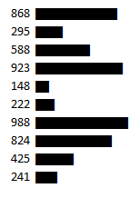
Here’s another example with numbers between 100-1,000, if I were not to adjust anything from the previous formula:

rept function excel bar chart graph

If I were to use the above formula as is, you can see my bar chart is going to explode with bigger numbers. So what I’d want to do is adjust the number of times the characters above repeat, to a maximum of 35.

First, I need to determine what value should maximize the cell or bar chart. In the above data set, 988 is the largest number. However, if my scale goes up to 1,000, that might be a better number to use as the maximum.

In that case, my formula for the number of repeats will look something like this: (value/1000)*35. That way, for the value 988, that will return 34.58 as the number of times I’ll repeat the | character. If I use that formula for the data, here’s how it looks now:

rept function excel bar chart graph

Adding more formatting

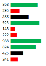
Now, I’ve got a bar chart that looks a lot more contained. However, this is still kind of a bit boring. So what I can do is add some conditional formatting to help make some of the items stand out a bit more:

rept function excel bar chart graph conditional formatting

In the above example, I set rules for anything below 300 to be highlighted red and anything above 800 to be green. When applying the conditional formatting, make sure you’re changing the font color, not the fill color. For more information on how to set up conditional formatting, check out this post.


If you liked this post on How to Make a Bar Graph in Excel Using a Formula, please give this site a like on Facebook and also be sure to check out some of the many templates that we have available for download. You can also follow us on Twitter and YouTube.
accounting-1928237_640

How to Save an Excel Chart As a High Resolution Image

Do you use Excel charts in PowerPoint presentations or want to use them in some other programs? Then you probably know it’s not something that’s very intuitive and often when you save a chart from Excel it’s not the high resolution image that that you were hoping for. And embedding charts within PowerPoint is a whole separate headache altogether.

The good news is that there’s a fairly easy solution. In the past, I’ve used code to save a chart as an image file, but even that didn’t always work very well and it involves running a macro. Once you try stretching it out you’ll still likely see a bit of a reduction in quality.

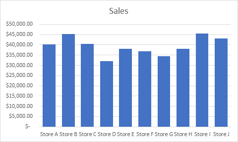
Let’s take this chart as an example:

sales chart excel

If I use the method to save it as a chart using VBA, this is how it will look expanded:

sales chart excel high resolution image

The image starts to get a bit faded and it’s far from ideal.

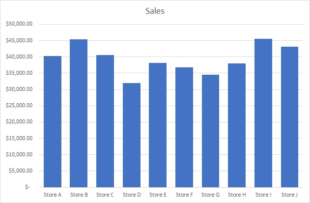
How do you get around that? Save the file in Microsoft Paint. Select the chart, copy it, and paste it into Paint and then save it as an image file. Besides cropping it, I don’t do any editing or special changes to the chart. However, the chart still needs to be a decent size in Excel so if it still looks faded, try making the chart bigger and then repeat the steps.

Here’s how the same chart looks, but using Paint:

sales chart excel high resolution image

It’s a higher quality image and the process is a bit easier unless you’ve got lots of charts that you want to save quickly. Visuals can be useful tools in presentations and I hope this has helped you learn how to save an excel chart as high resolution image.


If you liked this post on How to Save an Excel Chart As a High Resolution Image, please give this site a like on Facebook and also be sure to check out some of the many templates that we have available for download. You can also follow us on Twitter and YouTube.

white-male-2064876_640

How to Add Stock Quotes Into Your Excel Spreadsheet

Unfortunately, there’s no Excel formula that can add stock quotes for you. However, there is a workaround for that which can help you get what you’re after. In a previous post, I covered how to pull stock quotes using Google Sheets which is able to pull in prices and all sorts of other data. And in this post, I’ll show you how to get the data from Google Sheets into Excel.

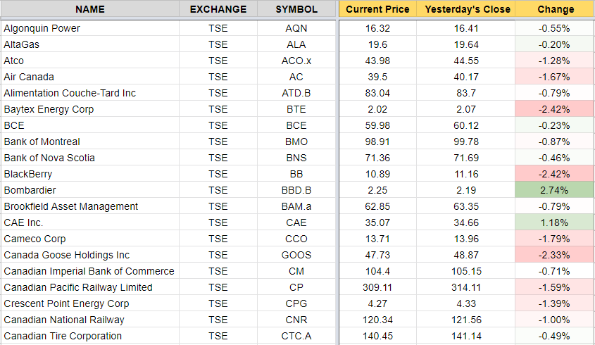
In essence, Google Sheets is your data source or database, and you’re going to import that into Excel. It’s not specific to stock quotes, but it’s an example of how you can accomplish the same thing. So first up, you want to create your file in Google Sheets using that earlier post as a guide. Here’s an excerpt of what my file looks like in Google Sheets:

google sheets stock prices

Once you’re ready, it’s time to link your Excel file to that Google Sheets file, and here’s how to do that:

How to Link Google Sheets to Excel

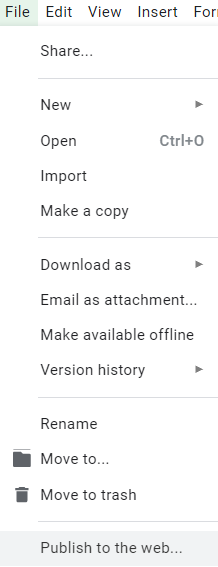
  1. On the File menu, click on the button to Publish to the web
publish to web google sheets

On the next screen, you should see something like this:

publish to web google sheets

2. Select the tab that you want to export under the Link section and change Web page to Comma-separated values (.csv) and click on the Publish button, that will generate a URL:

publish to web google sheets

3. Copy the URL that was generated in Step 2 and go back into Excel and under the Data tab click on the From Web button which is in the Get & Transform Data section

excel import google sheets

Paste it into the next screen’s URL field and click OK

import excel google sheets

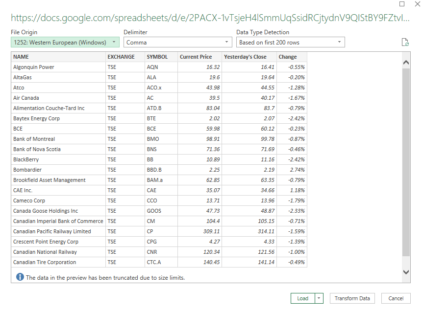
On the next page you should see a preview of your data and if it looks okay then click on the Load button.

import excel google sheets

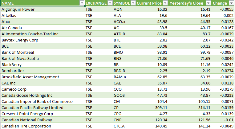
What you should see afterwards is what was on your Google Sheets tab from earlier:

import excel google sheets

And there you have it, your data from Google Sheets linked into Excel. If you make changes to your Google Sheets file, or if you want to refresh the stock quotes, right-click anywhere in the Excel sheet and select Refresh. Note that sometimes it may take some time before the file is updated on Google Sheets and before you’ll see any changes that you have made to the file.

It may not be an ideal solution if you’re looking to get stock quotes, but it gets the job done and avoids you having to try and find a complex formula or macro to pull the data that you want. You can use the Excel sheet with your Google Sheets data as a database and then lookup the stock prices from another sheet. The benefit of using Google Sheets is that you can have the best of both worlds – putting data online that you can easily update, and not be limited to Google Sheets and be able to edit and manipulate it as you need to in Excel.

Word of caution: if you delete or move around data in Google Sheets it could cause issues, especially if columns are missing and when you go to refresh it cannot find them anymore. If there is an error as a result of it or if you need to change the source, you’ll want to edit the query. When you click on the data in Excel you should see a section for Queries & Connections where you can edit the query. This is where you can select which data you want to include as well as change the source that you are pulling from. However, if it may be easier to just re-publish the data.


If you liked this post on How to Add Stock Quotes Into Your Excel Spreadsheet, please give this site a like on Facebook and also be sure to check out some of the many templates that we have available for download. You can also follow us on Twitter and YouTube.

wildcard1

Finding Partial Matches and Using Wildcards with VLOOKUP

If you’re looking up data, often times just using a VLOOKUP function can be enough to get you your desired result. Sometimes, however, it doesn’t do enough, especially if you’re looking for a partial match.
While you can set VLOOKUP to pull an approximate match rather than an exact match, that may not provide you with the desired results, especially if you’re using text.
Consider the following situation where you’ve got a series of charges from your credit card statement and want to find a particular vendor:
In the above example, let’s assume I’m looking for McDonald’s and do a regular VLOOKUP and set the approximate match argument to true, my formula looks like this:
=VLOOKUP(“MCDONALD’S”,B:B,1,TRUE)
And the result I get is this
As you can see, it’s not what I was hoping for. Excel can’t figure out that I’m looking for the second result, and simply gives me the last one.
Using Numbers with the Approximate Match
The approximate match isn’t useless in VLOOKUP, in fact, when it comes to numbers, it can be very accurate.
Consider the following example:
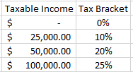
If I want to find out the tax bracket that a given income level relates to, I’ll use this formula
=VLOOKUP(G11,D:E,2,TRUE)
Assume column D is the taxable income and column E is the tax bracket %, with the taxable income I input being in cell G11.
Using this formula, if I put an income of $0 in G11, my tax bracket is correctly returned as 0%. It’s not until I enter $25,000 that it will return 10%. 
Excel understands numbers better than words, and so it knows that since $24,999 is not greater than or equal to $25,000, that it still belongs in the first tax bracket, the one that was 0% and started at $0. 
If I enter $105,000 as my income amount, then it also correctly knows that I’m in the 25% tax bracket since that is the highest bracket in the list.
If, however, I don’t put the brackets in the correct order my results won’t be the same. In order for this type of calculation to work, you need to start from the lowest value to the highest.
How Can We Get Text to Work?
If you want your partial text matches to work, you’ll want to use wildcards. What you can do is add an asterisk before and after your search term, which will then return even a partial match. Here’s an example of how the updated formula might look from the first example:
=VLOOKUP(“*MCDONALD’S*”,B:B,1,FALSE)
This might look a bit confusing since now I’m actually not looking for an approximate match, but rather an exact one, as indicated by the FALSE argument at the end. 
But because the asterisks will grab everything before and after my text, technically I do want it to match exactly, since it’ll search for my string as well as anything before and after it.
The result:
*Note that the formula is not case sensitive. Whether I type in MCDONALD’S or mcdonald’s, it would have no impact on my result.
As you can see, now I get the partial match that I was looking for. The danger, however, is that your partial string isn’t unique enough. If I were to use the word STORE as my string, I would get the first result that is a match, and in this case that would not be what I want.
Because VLOOKUP will return the value for the first time there was a result, you want to ensure its not a common string that will be found more than once. 
pay-2446670_1280

Extracting the Largest and Smallest Values in a Dataset

Retrieving the maximum and minimum values is done relatively easily in Excel using the MIN() and MAX() functions, but what if you wanted to extract the five largest or smallest values?

Two lesser-known functions can help you achieve this: SMALL and LARGE. Both functions work the same way and have the same arguments: (array, k)

In the first argument (array), you select the data you want to pull your value from, and the second argument (k) is how large or small it is with respect to the data (e.g. a value of 5 would give you the fifth largest or smallest value, depending on whether you are using the LARGE or SMALL function).

You could recreate the MAX and MIN results by placing a value of 1 in the second argument, for example:

=SMALL(A:A,1) would return the smallest (minimum) value in column A
=LARGE(A:A,1) would return the largest (maximum) value in column A

However, the real value in using the SMALL and LARGE functions is being able to pull the next smallest, or largest number.

You can use the ROW() function to help you do this.

If you needed to pull the 10 largest or smallest values from a range of data, rather than manually changing the k values manually, what you can do is use the ROW() function, and use ROW(A1) in the first argument and then drag the formula down.

The relative references will change the value to A2, A3, A4, etc. Now whether you use A or B or C as the column doesn’t matter since the formula is only going to calculate the row number.

The formulas might look something like this, assuming you data is in column A:

=SMALL(A:A,ROW(A1))
=SMALL(A:A,ROW(A2))
=SMALL(A:A,ROW(A3))

The value for ROW(A1) is 1, and for ROW(A2) it is 2, so you can see how just by dragging this formula down you can easily increment your formula and pull the next largest or smallest number.

The above example would get you the three smallest values in the data set, whereas the following would return you the three largest:

=LARGE(A:A,ROW(A1))
=LARGE(A:A,ROW(A2))
=LARGE(A:A,ROW(A3))