vlookup1

3 Reasons You Should Still Use VLOOKUP

Many people will tell you that you should use INDEX/MATCH instead of VLOOKUP or that you should use a new function like XLOOKUP instead. But you shouldn’t be so quick to ditch arguably the most popular function on Excel as it’s still very useful. Below are just three reasons why VLOOKUP is still incredibly valuable:

1. It’s really quick to set up

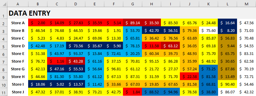
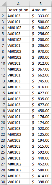
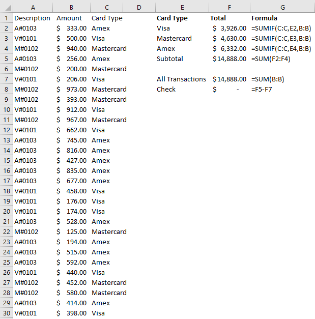
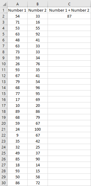
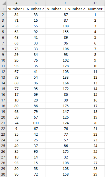
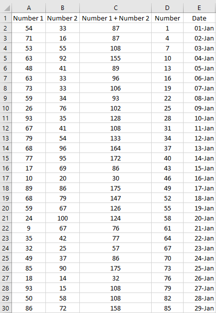
If you’re using a combination of INDEX/MATCH, you’re going to have to use two functions, correctly set them up and nest one inside the other. Especially if you’re not used to it, it can take some time to set it up. Sure, it’s not like it’s going to take hours or even minutes to do, but if you need a quick lookup and VLOOKUP can do the job, why not just use it? Here’s how quickly it takes to set it up:

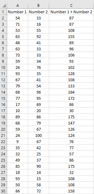
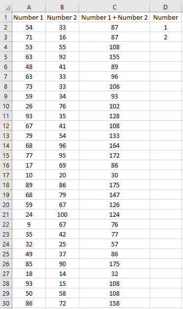
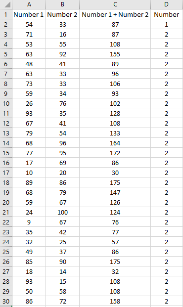
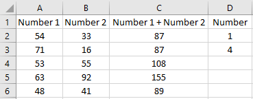
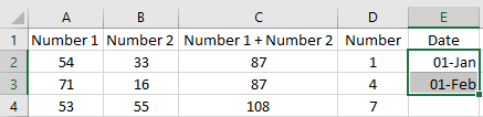
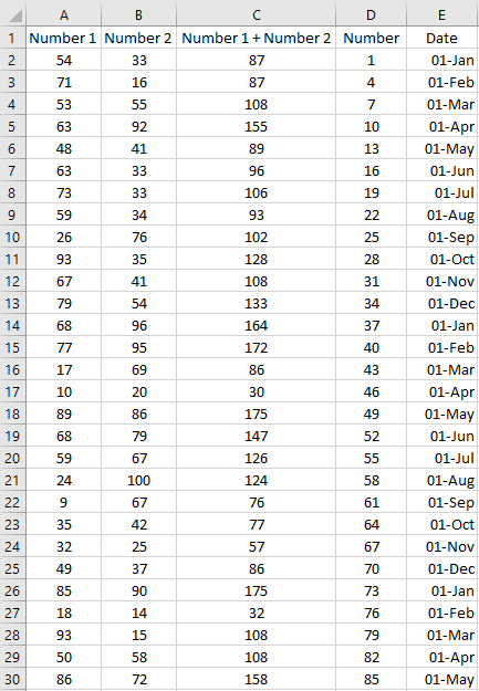
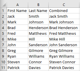
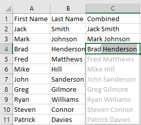
In the above example, I do a VLOOKUP in about five seconds. If you’re setting up INDEX/MATCH, you might still be trying to figure out which column to use for your MATCH argument. Being able to do VLOOKUP without almost thinking is what makes it such a great function, its speed is through the roof. Since you know the first column of your range is where you’re looking up values, it simplifies the process of selecting the columns and then you’re just counting how many columns over you’re extracting data from.

A couple of ways I expedited the formula above is by not typing out the entire function name (just entering VL and then tab to autocomplete the name), using 0/1 instead of typing out True/False and by not closing the last “)” as Excel will automatically do this for you.

Sure, it won’t work in all scenarios such as if you need to go left, that’s a well-known limitation of VLOOKUP. But as long as that’s not the case, there’s really no reason you need to bother with INDEX/MATCH when VLOOKUP will do the job. I’ve been using Excel for decades and I still love to use it when I can because it’s so easy to set up.

2. VLOOKUP is very versatile and will work on old versions of Excel

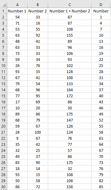
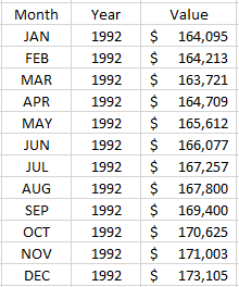
VLOOKUP may not be able to go left, but it can do wildcard searches and it can work if you need to pull the closest value — this is really useful if you’re dealing with tax brackets or anywhere that you’re looking for the closest value without going over (e.g. where you set the last argument to TRUE to look for approximate matches). While many people may use it strictly for exact matches, VLOOKUP is much more powerful.

And here again, using VLOOKUP in these situations is likely going to be no more difficult than the alternatives. While the temptation may be to use an exciting new function like XLOOKUP, the one big disadvantage is that it’s not available on older versions of Excel. With VLOOKUP, even if you’re working on a version that’s 20 years old you won’t have to worry about whether the formula will work.

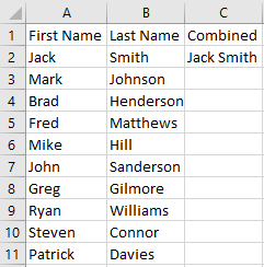
3. Ease of use makes it ideal for training novice users and making templates with

Not only is VLOOKUP easy to set up, but it’s easy to understand compared to other, more complicated functions. If you’re making a template or need to train users, you don’t want to worry about them knowing complex formulas, especially when it involves nesting functions. Or telling them about a formula that may not work on their version of Excel. VLOOKUP’s also a good stepping stone for beginners to get them accustomed to how Excel formulas work.

Complex formulas are easy to break and harder for inexperienced users to fix. That’s why VLOOKUP’s ease of use is a key reason it’s worth using. If you’ve ever had to fix someone else’s formulas, you can definitely appreciate that keeping formulas as simple as they need to be can go a long way in making it easy to maintain and fix a spreadsheet.


If you liked this post on why you should still use VLOOKUP, please give this site a like on Facebook and also be sure to check out some of the many templates that we have available for download. You can also follow us on Twitter and YouTube.

3D Bubble Chart

How to Make a 3D Bubble Chart in Excel

The bulk of Excel users will likely stick to 2D charts that just have an x and y axis. But if you want to add a third element and give your visuals a bit more context, you can create a 3D bubble chart in Excel. Below, I’ll show you how to do just that.

In the following example, I’m going to compare the average mobile data cost in select countries versus their average speeds. I’ll also include what percentage of their populations are smartphone users. Often you hear about one of these metrics but not all three. This is a good example of how adding in more data can provide more context and a more complete picture.

For instance, Canada has one of the highest costs per GB while India has the lowest. But how does that stack up when you consider speed and how much of the country actually uses a smartphone. Using a 3D bubble chart, I can easily add that extra context.

Setting up the data

I pulled in these numbers from a variety of sources to make this work (there were some gaps that I also had to estimate based on older data) and using a series of vlookup formulas I connected them all together.

As far as setting up the data for a chart goes, it’s not much different than what I would do for a 2D chart. Enter the headers and then all of the values. Here’s a summary of what the table looks like with all three data points per country:

Cost per gb, speed, and percentage of smartphone users among countries.

Unfortunately, if I try to just create a 3D chart the way I normally would a 2D chart, I’d get a bit of a mess:

Default 3D bubble chart.

Setting up the chart

As you can see, this initial set up isn’t very intuitive. There’s a bit more manual entry involved when setting up a 3D bubble chart in Excel for the first time. What I’m actually going to do is remove all the default data and delete all these items.

Modifying the data source for a bubble chart.

You’ll get the above dialog box if you right-click on the chart and click Select Data. I then click remove from all the Legend Entries until it’s all empty:

Adding data sources for a 3D bubble chart.

Now, I’ll click on the Add button to add each entry individually to ensure my data’s pulling correctly:

Adding a series.

Here’s an example of one that’s filled out:

Adding values for a 3D bubble chart.

After clicking on OK, then I’ll start to see a bubble chart forming:

One bubble in a 3D chart.

As I repeat and continue adding more items, my bubble chart ends up looking like this:

3D bubble chart showing country average cost per GB, average speed, and percentage of smartphone users.

What the chart tells us

India went from being in the top-right quadrant to the bottom left. This incidates that while it’s low cost per GB, it’s average speed is the slowest of the countries on this list. And its relatively small bubble also tells us that a small fraction of the population uses smartphones compared to the other countries here.

It also confirms Canada’s still the most expensive. Australia offers much cheaper rates while having similar speeds and a similar portion of the population using smartphones.

You can easily see the details of each individual bubble. If you hover over any one of these bubbles you’ll now get information showing all the values related to them. Here’s the U.S. one:

Smartphone with one bubble.

It may seem like a painstaking effort to create all the bubbles but once you’ve got it set up you don’t have to repeat these steps. You can change the values and the 3D bubble chart will automatically update. The problem is that Excel doesn’t make it easy to set it up initially. But once you’ve selected which values you want to pull, then it gets easier to update the information and use the format again.

The big advantage of using a bubble chart in Excel is that it provides much more information in just one snapshot than a simple 2D chart would give you. Using a 2D chart, I’d only be able to display two data points for each country. A 3D chart allows me to add even more information into a single chart. And that makes it much more useful to the reader.


If you liked this post on how to create a 3D bubble chart in Excel, please give this site a like on Facebook and also be sure to check out some of the many templates that we have available for download. You can also follow us on Twitter and YouTube.

circularreference

How to Find Circular References in Excel

If you’re getting an error message in your Excel spreadsheet that there’s a circular reference, that means that at least one of your calculations is referencing back to itself in one way or another. It doesn’t always have to be that two cells are referencing one another. Even indirectly referencing back to a cell can cause a circular reference error.

First thing’s first though, you have to find out where your circular references are before you can fix them, which isn’t always easy. Below, I’ll show you how to find circular references in Excel using multiple approaches.

Finding circular references

Let’s look at a very simple example where cells A1 and B1 are just referencing one another. This is what the error would look like on the two cells:

The blue arrows pointing at one another indicate that the cells are referencing each other. If the circular reference involves another worksheet, you’ll see something like this:

If you double-click on that line it’ll bring up the Go To dialog box which will show you which cell it’s referencing on another sheet:

From here you can click on the item in the Go To box and click OK and it’ll take you to that cell.

If you’re able to see blue arrows or the link to another spreadsheet, then it’s easy to trace where the circular references are . But if you’ve got a large spreadsheet, it may not be so easy spotting where the circular references are, which is why you may need to look at other methods.

One way is by looking at the bottom left corner of Excel, where you’ll see it mention circular references if there is an error:

And if you’re on the same sheet that the circular reference is on, you’ll also see which cell is causing it:

But it won’t be able to show you all of the circular references if there are more than one here as there’s obviously limited space to do that.

Another way that you can look for circular references is by going to the Formulas tab and then clicking on the down arrow next to the Error Checking button:

Then, click on the Circular References button and you’ll see a list of all the circular references in the workbook:

You’ll notice this way it will also show you which sheets have circular references.

Fixing circular references

Once you’ve identified which cells need to be fixed, then what’s left to do is adjust the cells. If you’ve just made an error then all this may involve is just deleting the contents of the cell entirely or just removing the reference to the cell in order to remove the circular reference.

But in many cases, it’ll involve a formula. And this is where it can get a little tricky as you may need to restructure your formula to ensure it’s not circling back in some way to the original cell. One possible solution can be to add another field as an intermediary to ensure you aren’t trying to do too much in just one formula.


If you liked this post on how to find circular references in Excel, please give this site a like on Facebook and also be sure to check out some of the many templates that we have available for download. You can also follow us on Twitter and YouTube.

5ways

5 Ways to Count and Extract Unique Values in Excel

There are many ways you can pull and count unique values in Excel, and below, I’ll show you five ways you can do so and when you should use each method.

For this example, I’m going to use a dataset from data.gov relating to consumer complaints about financial products. It’s a large list and by listing the unique values we can see how many different complaints there are and which are the most common ones.

Using the UNIQUE function to extract values

The UNIQUE function isn’t available on all versions of Excel. You can try to type it in as a formula to see if you have access to it. If you’re able to use it then that’s great news, because this is the easiest way to pull unique values.

In my data set, I want to extract all the unique issues customers have had. I can quickly generate a unique list of values by using this function and just selecting the entire range of cells in column D. The formula is as simple as this:

=UNIQUE(D:D)

It returns an array and the unique results are now in the column where I entered the formula (E) and I’ve highlighted the list in yellow:

unique values using the unique function.

This gives me the entire list of unique values but it doesn’t tell me how many unique items there are. I could, of course, just use a count function to tally up all the values in column E. But there’s also another, more efficient way to do that. I can enclose the UNIQUE function within the COUNTA function that counts nonblank cells. Here’s what that formula looks like:

=COUNTA(UNIQUE(D:D))

This formula tells me that there are 167 unique values in column D. I don’t even need to first run the UNIQUE function on its own, I can do this all in one cell and quickly get the number of unique values in the list. This is by far the simplest and most elegant way to do this in Excel.

If I wanted to see the number of times a unique value appeared on the list in column D, I could use the following formula:

=COUNTIF(D:D, E2)

Where E2 is the issue that I want to count.

Let’s move on to another approach, one that’s more common in newer Excel versions.

Using the remove duplicates button

Another way that you can pull the unique values from a list is by clicking on the Remove Duplicates button located on the Data tab:

remove duplicates button

However, the caveat here is that this button will actually remove items from the existing list that aren’t unique. And so what you’ll want to do first is copy your list of values to another column, and then select that column and click on the button.

At that point, you’re back to having to count the number of duplicates in the list. A function like COUNTA could do the job. And then to tally the totals by item would involve using the COUNTIF function again.

Going old school with the advanced filter trick

If you’ve worked on older versions of excel where you didn’t have the luxury of buttons filtering out duplicate values for you, you may have used an advanced filter. How this works is you enter the header into some other adjacent range like so:

Using the advanced filter to create a unique list of items.

Then, click on a value in column D, and then click on the Advanced Filter button on the Data tab, which looks like this:

Advanced filter button

The advanced filter should automatically detect the range you’re looking to filter. You’ll then see a pop-up box as follows:

Advanced filter pop-up box.

I’ll tick off the Copy to another location button and I’ll select F1 which is where my header in the adjacent range is located.

Filling out the advanced filter pop-up box.

Ticking off the box for Unique records only is what makes the filter pick up only the unique values, which after clicking on OK will now populate column F:

A list of unique values after running the advanced filter.

The advantage of doing it this way is you don’t have to copy a list and then remove duplicates, and essentially the end result is the same. This is the method you may want to use on older versions where you don’t have access to the newer options.

There’s also one another way that you can filter out unique values, and it’s one of the more common approaches I’ve seen.

Using pivot tables

I cringe a little when I see people using pivot tables solely for the purpose of create unique lists. It’s overkill, especially given the methods listed above that do the job just fine. But it does do the job and if you’re wanting to do some sort of analysis, it’s a great way to do it all in one shot.

For example, using my data set I can quickly turn it into a pivot table and not only create a unique list but also do a count by issue and sort it from highest to lowest:

Creating a pivot table.

Rather than using COUNTIF, I can just let the pivot table do the counting for me. If you want to calculate the number of unique values, you can again use the COUNTA function. You can use it to count the number of values in the Row Labels section of the pivot table. You’ll of course want to adjust for any headers and grand totals to ensure you aren’t counting too many rows.

Use our FREE Add-in!

Whether you need to count unique values or create a list of them, you can easily do them through our free add-in. You don’t have to worry if you have the right version of Excel and it’ll work with the click of a button:

Howtoexcel.net free add-in that can filter and count unique values.

And that’s just one part of a much larger set of macros and buttons that can simplify your workflow:

Complete list of macros on the howtoexcel.net add-in.

When should you use a particular method?

There are many options to choose from here when generating a unique list of values. Here’s a quick breakdown of each method and when you’ll want to use each one:

  1. The HowtoExcel.net Free Add-in. This will simplify many of your tasks beyond just populating and counting unique values.
  2. The UNIQUE function. Outside of the add-in, this should be your go-to option if it’s available on your version of Excel. It’s easy and quick to not only generate a list of unique values but to also count them. The advantage of this method is that it will also auto-refresh if your data changes since it’s a formula. You won’t have to re-run the formula to get a fresh list of unique values.
  3. The Remove Duplicates button. This is the next-best option to use if you aren’t able to use the UNIQUE function. It involves just the click of a button and you just need to remember to copy the list.
  4. The Advanced Filter. Use this if you’re working on an old version of Excel and don’t want to install an add-in.
  5. A Pivot Table. There’s no reason to use this method unless your list of values changes often and you need a quick way to refresh the list. However, if you’re also looking to analyze the data then using a pivot table could quickly jump to the top of this list as it’ll help you sort by unique values and also do calculations very quickly.

If you liked this post on how to extract and count unique values in Excel, please give this site a like on Facebook and also be sure to check out some of the many templates that we have available for download. You can also follow us on Twitter and YouTube.

taccount1

Live T-Account Template

If you’re an accountant, you know that quickly doing a t-account can sometimes help you plan your journal entries and save you some headaches later on. But sometimes it can be time-consuming and a bit cumbersome to go through the process of setting everything up in an Excel spreadsheet. That’s where my new, live t-account template can help you.

Simply go to this link and you’ll be taken to a page where you can start creating your t-accounts on the fly. All you need to do is first make sure you name the accounts along the top and then record the entries on the left-hand-side. The accounts will automatically update as you enter the data.

Here’s a quick demo of how the page works:

It supports 20 line items and five accounts. And if you make a mistake or want to make another set of t-accounts, you can just refresh the page to clear what you’ve entered.


If you like the live t-account template and find it useful, please give this site a like on Facebook and also be sure to check out some of the many templates that we have available for download.

colorcode1

Color Calculator Template: Sum by Color in Excel

Unless you’re still stuck on old versions of Excel, you probably know that you can filter data using colors. And by doing so you can use the SUBTOTAL function in excel to tabulate those amounts. But in this post, I’m going to show you something a little different. By using a macro, I’ll highlight cells containing values and then sum them by color in Excel, without needing a subtotal or a filter. This free template will just use VBA to populate the totals.

How the template works

In this template, all you need to do is enter your data and then assign whatever formatting you want to use to identify a cell to the corresponding category. As long as a cell has the exact same formatting as the category, it will be included in that category’s calculation.

I got the idea when I was trying to quickly analyze expenses and didn’t want to go through a whole process of putting it into a complex budget template. Rather than setting up logic to classify whether an expense falls into one category or another, I thought color-coding could be another way you could quickly group expenses.

Here’s a quick video showing you the template in action from color-coding cells to calculating the totals:

Setting up the data

In the template, there’s one section dedicated to the raw data where you’ll enter your inputs:

You can input data up until column N, although I’ve left the column blank for a buffer. In this example, I’ve put in random numbers and grouped them based on a store value in column A. This can be all numbers, it doesn’t really matter, I just preferred to have some grouping.

Next to the data entry, I’ve got a list of categories set up in column O:

You can add as many categories as you like. How they’re color-coded here is how you’ll need your cells will need to look to ensure they’re in the correct categories. For instance, any cells that are highlighted in light blue will go into Category I. Whereas anything in a dark red will belong to Category E.

You may think this would be a painful process to try and color-code your data based on all these different categories. After all, what if you get the shade wrong or the font color is wrong. The solution’s really simple and you just need to use our trusty friend, the Format Painter. If you’re not familiar with it, this is what it looks like:

It’s on the left-hand-side of the Home tab where the copy buttons are. What you can do is select the category you want to be assigning data to, click once on the Format Painter and then click on the cell you want to highlight with that exact same formatting.

If you’ve got multiple cells that you want to apply the formatting to and don’t want to keep repeating this exercise, then Double-Click on the Format Painter. You can now continue selecting cells and the Format Painter will take care of the formatting for you. You won’t need to re-select it each time. Once you’re done with the formatting and want to stop applying it, click on the Format Painter again to stop.

I’ve color-coded some of my data based on the categories, and here’s how it looks:

Updating the calculations

On the right-hand-side of the page there’s a button that says Update. This will update the totals based on the color-coding. You’ll need to have macros enabled for this to work. Above the button you’ll see the total of all the values in columns and how much is unallocated.

Clicking on the update button will trigger the macro to run the calculations. After pressing the button, here’s what my categories look like and the totals corresponding to their color-coding:

You’ll notice I’ve also created visuals to see the relative size of each category using the REPT function. If you’re interested in learning how to use this function, check out this post.

Anytime you make changes to the color-coding, be sure to hit the Update button. I didn’t want the formulas to update every time there was a change on the sheet because that can sometimes slow a spreadsheet down, especially since it would involve recalculating all the totals.

The code

Here’s the VBA code itself on how the update button works:

Sub Oval1_Click()

Dim clvalue, clcolor As Double
Dim cl, colorrange As Range
Dim lstrow As Integer

lstrow = ActiveCell.SpecialCells(xlLastCell).Row

Set colorrange = Range("colorrange")

'clear data range
colorrange.Offset(0, 1).ClearContents


For Each cl In ActiveSheet.Range("A1:O" & lstrow)

    If IsNumeric(cl) Then
    
        clcolor = cl.Interior.Color
        
            For Each lookupcl In colorrange
    
                If lookupcl.Interior.Color = clcolor Then
                    lookupcl.Offset(0, 1) = lookupcl.Offset(0, 1) + cl.Value
                    GoTo nextcl:
                End If
    
            Next lookupcl
    End If

nextcl:

Next cl

End Sub

There’s a named range called “colorrange” that it cycles through, and those are the categories in column O on the spreadsheet.

Using the template

This isn’t a terribly complex template to use. However, it can help if you want to quickly group items. It’s a unique way to classify expenses rather than just using drop-downs and complicated formulas. And it makes it easy to sum data by color in excel. The way I found it useful was to list your vendors or stores in column A. Then, arrange transactions by date (e.g. the first transaction is in column B, then C, and so on). But this can be used in a variety of different purposes to help classify data.

If you want to reset the calculations, just change the data back to the default formatting or something that doesn’t correspond to a category you already have, and then click update.

Download

The template is free to download and it’s available here.


If you liked this post on how to sum by color in Excel, please give this site a like on Facebook and also be sure to check out some of the many templates that we have available for download. You can also follow us on Twitter and YouTube.

invoice1

Income Tracker Template

If you earn income from multiple jobs, you know how important it is to keep track of how much you’re making. If you work too little, you may not be making as much as you were planning. And if you’re working a lot more, you could afford to give yourself a break.

Whether you’re self-employed or you supplement your income by driving for Skip the Dishes or Uber, there’s no shortage of ways to make money these days which doesn’t involve working a regular 9-to-5 job. The income tracking template I’ve created will allow you easily track your income from various sources and help you stay on track if you’re targeting a certain income figure for the month or year.

How the income tracker template works

There are two tabs on this template: inputs, and calendar. The inputs are where you’ll go to enter in your income, so let’s start there.

On the Inputs tab you’ll enter the date you earned the income, the source, and how much you made. You can setup hourly or item rates. You can also just enter in a fixed income amount. Here’s an example of some sample inputs:

For jobs like Skip the Dishes or Uber where you don’t earn an hourly wage, you’ll need to enter a manual amount. If you sell items on eBay or Amazon where you might have an average price, you could potentially use a rate. And that’s where the rate schedule comes in handy:

This could also work if you work a part-time job or something where the rate is fairly steady. Whether it’s per hour or per item is irrelevant. The point is to try and make the input section as easy as possible and you don’t need to necessarily use the rate schedule if you don’t need it.

But if you enter a number under the hours/items section, the income earned formula will be looking for a rate to multiply that by — you’ll get an error if it can’t find one (unless you enter a manual total, which will override the calculation). So if you don’t have a rate for that source of income, don’t enter anything in the hours/items section and just use the manual input column.

Once all your data’s entered in, it’s time to head over to the Calendar tab.

A summary of all your income

For the week that I entered the weekly income for, here’s what the calendar shows:

You can visually see how much you’ve made each day and there is also a weekly total at the end. The key to everything calculating correctly is the value in the source column needs to match what you entered on the inputs tab.

There’s also a column further down titled Annual Run Rate which will tell you how much you’ll earn over the course of the year if you work a full year at your current weekly pace.

It’s simply a way to gauge whether you’re on track that week for your annual goal or not. That brings me to the next section: the setup.

Settings and goals for the income tracker template

If you scroll over to the right on the calendar tab, you’ll see an area where you can specify a number of different settings and goals. Only change the items that are highlighted in grey. Let’s go over each one:

  • Work weeks. This is how many weeks you plan to work during the year. If you are going to work every week then you can leave this at the default value of 52. If you’re going to take some weeks off, then deduct from that total. The purpose of this is for calculating the annual run rate.
  • Include partial month. If you strictly only want to include the days that fall in the month when calculating your weekly totals, then set this to ‘N’. If you set this to ‘Y’, then the first and last weeks of the month could include parts of the previous and upcoming months, depending on where the month ends and starts. The purpose of setting it to ‘Y’ would be so that every week is a full week. For instance, July 2020 began on a Wednesday. If you set partial months to ‘Y’, then your July calendar and weekly totals would include June 28-30. If you set partial months to ‘N’, then those days would not show up on the calendar and they wouldn’t be included in your weekly totals.
  • Monthly goal. This is the total income you want to earn on a monthly basis.
  • Annual goal. This is the total income you want to earn for the full year.

Below the setup options, you’ll also see a summary of your sales by month. You can enter the year if you’ve got multiple entered. But by default, I’ve set this to 2020.

Tracking your goals

Next to the calendar, you’ll also see charts showing you the progress that you’re making relative to your goals for the month and year:

The different gauges show different things. The first one is how close you are to reaching your monthly goal. The next one is how close you are to your annual run rate based on the monthly income you’ve earned thus far. And the third takes a tally of all of the income you’ve entered on the inputs page and compares it to your annual goal.

Download the template

This template is free to use and allows you to stay on top of all your income sources. The version is locked down to minimize data entry errors and does come with an ad. But as it is, it will allow you to enter in your data and the template is fully functional. You can download it here.

Currently, the template supports five income sources and you can adjust those in the free version. With the premium version, everything is unlocked and there is no ad. And you could add more income sources on the calendar tab if you’re comfortable adding rows and updating the formulas.


If you liked this post on the income tracker template, please give this site a like on Facebook and also be sure to check out some of the many templates that we have available for download. You can also follow us on Twitter and YouTube.

ArrayFormula1

Use an Excel Array Formula to Do Multiple Calculations at Once

Array formulas can be challenging to understand but they’re worth learning as they can create significant efficiencies for your spreadsheets. Below, I’ll show you how you can do two calculations within a single array formula in Excel.

Using an array to categorize and sum data

To demonstrate how to do multiple calculations, I’m going to use credit card transactions as an example:

Credit card transactions showing descriptions and amounts.

Suppose in column A you have the first letter indicating whether it’s a Visa, Mastercard, or Amex. The numbers afterward could be authorization codes. And then in column B, you have the total dollar amount of the transaction. Without the use of an array, what you might end up doing is creating another column that would use the description in column A to determine the card type. Then, you could use a SUMIF function to calculate the sales volume by card type. Here’s how that might look:

Summarizing credit card transactions using a SUMIF function.

This is an approach I’d expect most people to use. It’s perfectly fine but if you’re not able to add an extra column or need to make your formula more efficient, that’s where an array can be helpful.

Through the use of an array, you don’t have to create that extra column. You can determine the card type and also sum the data all in one cell. Let’s start by calculating all the Visa transactions.

First, we’ll start by determining the card type — this process would have been the same regardless of whether you’re using an array or a SUMIF calculation. And to do this, we need to use the LEFT function to grab the first letter and determine if it is a ‘V’ to indicate Visa. This is how the formula looks like:

LEFT(A2:A30,1)=”V”

Right now, we can’t really use this on its own, it’ll just return TRUE or FALSE values. What we can do is put this formula inside of an IF function and using it as the first argument:

=IF(LEFT(A2:A30,1)=”V”

In the second IF argument, we’ll want to return the values in case the condition is true, and that V is the first character of the corresponding value in column A. In such a case, we just want to return the values that are in column B:

=IF(LEFT(A2:A30,1)=”V”,B2:B30

And if the value in column A doesn’t start with a V, then, in that case, we just want the value to be blank:

=IF(LEFT(A2:A30,1)=”V”,B2:B30,””)

I use blanks rather than a 0 value because it’s cleaner, and you’ll see why that is when I evaluate the formula further down.

The formula will now return a list of values, ignoring those which don’t start with a V in column A. All that’s left now is to sum those values. To do that, we’ll simply wrap the function above inside the SUM function and freeze the cells:

=SUM(IF(LEFT($A$2:$A$30,1)=”V”,$B$2:$B$30,””))

And here’s the result:

Summarizing credit card transactions through the use of an array formula.

If you’re using an older version of Excel, you may need to use CTRL+SHIFT+ENTER to turn this into an array formula. But on newer versions, it’s no longer necessary. I didn’t need to in my case, and I can show you that it still calculates as an array. If I run the EVALUATE FORMULA button on the Formulas tab, you’ll see that it is evaluating each cell and pulling the first letter from each of the values in column A:

Evaluating the first part of the array formula.

Then it converts that into a series of TRUE or FALSE depending on whether those values are equal to ‘V’:

Evaluating the second part of the array formula.

And then it returns the corresponding values if they are TRUE, and “” if they are FALSE:

Evaluating the third part of the array formula.

Notice how easy it is to separate the numbers out from the blank cells. Had I used zeros rather than blanks, it would be a bit more difficult to discern which were Visa transactions and which were not. Anytime you can hide zero values, your data is always a lot cleaner.

The last step of this formula involves just summing all the values, which gives us our total. This is a much simpler approach than having to create another column for determining the card type. You can also use this with other functions. If we wanted to get the average Visa transaction, we could just sub out the SUM function with the AVERAGE function. Arrays are very powerful and can do some incredible things.


If you liked this post on how to use an Excel array formula to do multiple calculations at once, please give this site a like on Facebook and also be sure to check out some of the many templates that we have available for download. You can also follow us on Twitter and YouTube.

auotfilldata

How to Autofill in Excel

There are many ways you can speed up data entry in Excel. Using autofill can be particularly helpful because Excel can normally figure out patterns and the formulas that you’re going to want to enter. It can save you lots of time from having to manually enter values or formulas yourself. Below, I’ll show you how you can autofill values and formulas in various situations and how you can also use flash fill.

How to use autofill

Automatically filling in data is easy in Excel and it’s as easy as double-clicking. Let’s start with a very basic example. Here’s some data I’ve entered using a random number generator:

Data entered in Excel before running autofill.

The formula in column C is just adding the corresponding values in columns A an B. It’s a simple formula but that doesn’t mean I want to enter it in repeatedly. To save me the the hassle having to do that, I’ve got a couple options.

The first is to double-click on the edge of the cell that has the formula in C2:

Selecting a cell in a data set.

You’ll notice on the bottom right corner there’s a square there. If you hover your mouse over it your pointer will turn into a black cross. When that happens, double-click and excel will autofill the same formula all the way down to the rest of the rows that you’ve filled in:

Data after the autofill has been run.

You could also manually drag the corner down rather than double-clicking it.

Alternatively, if you want to specify how far down you want to autofill then there’s another approach you can take. Start by selecting your formula as well as how far down you want to copy it:

Selecting the cells you want to apply the autofill to.

On the Home tab, in the Editing section, there’s a Fill button I can click on which will give me some options:

Fill button options in Excel.

Clicking on the Down button will autofill the cells I’ve selected with the formula that I entered in the first row. The result is the same as when I double-clicked in the corner of the cell.

The main advantage of doing it this way is if you don’t want the formulas to copy all the way down to where your data ends. It’s not a situation I’ve ever come across and double-clicking is a lot more intuitive and a much simpler approach.

Filling in values

It’s not just formulas that Excel can autofill, it can even work on values. I’m going to add some numbers to my data set:

Numbers added to the data set.

If I try and autofill by double-clicking on the corner of cell D3 this is what happens:

Autofill working incorrectly.

Excel didn’t figure out that I wanted to keep on incrementing by 1 and instead it just copied the number 2 all the way down. When it comes to autofill, you can help Excel by selecting more data:

Selecting multiple cells before running the autofill.

I’ve selected the first two values in the data I want to autofill. Now, when I double-click and autofill from D3, here’s what happens:

Autofill working correctly after multiple cells selected.

Now that I’ve given Excel more of a pattern to work with, it’s figured out what I wanted to do. Even if I select an odd pattern like this:

Autofilling an unusual pattern.

Excel is still able to complete the pattern:

Autofilling by incrementing by three.

Autofill works also works with dates

Just like with numbers, Excel can figure out the pattern if I’m working with dates. Here’s a scenario where I’ve only got one date entered in: January 1

Autofilling dates.

If I autofill the rest of the data, it’ll increment by one day:

Autofill increments by one day at a time, by default.

If I don’t want to increment by one day, I can increment by month by giving Excel more data to generate a pattern from:

Multiple dates entered in Excel for autofilling purposes.

Now, using that selection, Excel knows to auto fill the remaining data by one month intervals:

Autofill incrementing by one month at a time.

Flash fill can even figure out your patterns without formulas

Now, let’s switch over to using flash fill, which can almost read your mind. In the following scenario, I have not entered any formulas in the data below:

Combining names in Excel.

The value in column C is supposed to be a combination of columns A and B joined together by a space. Without a formula, simply using autofill and double-clicking isn’t going to help in this situation, it’ll just copy the value in cell C2. This is where using flash fill can take you to the next level. If I select the value in cell C2, I can go back to the Fill button and this time select Flash Fill:

Selecting flash fill from the fill menu.

And here’s the result:

Data after running flash fill.

Incredibly, Excel’s filled in the remaining data and pattern with only one cell to work with and no formula entered. Even if I start entering the data manually, Excel will ofter to help me, showing me that it can fill in the pattern for me:

Excel offering to fill in the remaining values.

If I want to accept Excel’s help, I can just click on Enter and it will fill in the remaining cells. Excel doesn’t always get it right, but when it does, it can be a significant time-saver, especially if you’ve got lots of data to enter.

Why you may not want to use flash fill

Although flash fill can save you some time like in the example above, it won’t always work how you may hope. And relying too much on it can prevent you from learning how to use concatenate or other formulas that can make you more efficient in the first place.

It’s always better to use formulas and autofill as it’ll ensure that your logic remains intact exactly how you want it. And if you’re working on older versions of Excel that don’t have flash fill, you’ll be out of luck and finding yourself doing things manually again. There’s no substitute for a well-designed data structure that depends on formulas. You should always avoid hard-coding your data when possible.

And if you dump in more data into your database, you’re going to have to repeat the flash fill steps all over again. Unlike with formulas, Excel’s not going to update the values that you flash filled if you make changes later on. Flash fill can be helpful, but you shouldn’t rely too much on it.


If you liked this post on how to autofill in Excel, please give this site a like on Facebook and also be sure to check out some of the many templates that we have available for download. You can also follow us on Twitter and YouTube.

movingaverage

How to Do a Moving Average in Excel

If you’re doing any type of data analysis, a moving average can be useful in smoothing trends and normalizing data. Below, I’ll show you how you can easily create a moving average in Excel. The data will again be based on the retail and food services sales data that I used in my post covering how to transpose data.

With the data now converted from the summary table, it’s in the right format for analyzing and averaging the data.

Calculating an average

To calculate an average in Excel, all you need to do is use the AVERAGE function. Simply select the range that you want to average, and the function will take care of the calculation for you. Here’s an excerpt from the data set:

Sales data organized by month and year.

If I wanted to calculate the average for the year 1992, I could total the values relating to those years and then divide it by 12. The total comes to $2,007,617 and after dividing it by 12, I get an average of $167,301.42. But I can skip the step that involves dividing the data by using the Average function. Here’s a look at the difference:

Average calculations.

However, there’s a way we can simplify this even further. In this example, we still have to manually select the range that we want to average, and that’s not going to be optimal if you want to pull the average for every year. It’s also easy to make a mistake.

What we can use is the AVERAGEIF function in Excel. That function allows you to add criteria to your average. Here, we’ll use the year, 1992, as the criteria. And by doing so, we don’t have to worry about selecting the right cells since we can just select the entire column:

Averageif calculation.

You’ll notice the year is hardcoded, which isn’t ideal. Here’s how we can fix that while also making it easy to pull the average by year:

Averageif calculation by year.

This is a great way to average by year, but it’s still not a moving average. Let’s do that next.

How to make the average move with your data

Companies often track sales numbers for the last 12 months, also referred to as the trailing twelve months (TTM). It’s actually easier to do than averaging by year since there’s no criteria — you’re simply averaging the last 12 months. The one limitation here is that you have to have 12 months of data before you can start. Here’s how that would look in our example:

Simple moving average calculation.

It’s as easy as just selecting the previous 12 cells in the range, averaging them, and copying the formula down. However, you don’t have to select the data range, even if it is just a one-time thing. If you include the OFFSET function, you can make your formula a lot more adaptable and flexible. It allows you to move your data set, and you can also determine how many values you want to include in your average.

Here’s how a TTM calculation could look like using OFFSET:

Moving average calculation using offset.

This is a more complicated formula so let’s breakdown what’s happening here. The OFFSET function has multiple arguments, here’s a list of them:

  • Reference
  • Rows
  • Columns
  • Height
  • Width

The reference is just your starting point. In the first formula, I used cell C13 as that was the current value. It wouldn’t make sense to use data from a different row and I also want to make sure it’s in the value column since that’s where I want my data to come from.

Next, is the rows argument. I put -11 in this case because I want to start 11 rows higher than where the reference cell (C13) is. Moving 11 cells up would put me at C2, which is the first data point. The columns argument is left at 0 because I want to remain in the same column.

The height argument is key here because I want to ensure my data set contains 12 values in it. Without this argument, I would simply get the value from cell C2, $164,095. You can ignore the width argument or set it to 1, since you don’t need to include other columns.

If your data is organized in columns rather than rows, all you’ll need to do here is to switch around the arguments (e.g. rows would be in columns, height argument would go into width, etc.)

The last part of the formula is enclosing it within the average function so that it calculates the average.

Changing the number of periods you want to average

The big advantage of using the OFFSET function is now it’s a lot easier to manipulate your data and change how many values you want to include in your calculation. Suppose that instead of the last 12 months, we wanted to do a three-month average. All that would include is tweaking the OFFSET function so that it goes two rows back and includes three values. Here’s how that would look:

Moving average calculation using offset.

The key takeaway here is that the number of rows or columns that you want to go back will be one less than the number of rows or columns you want to include. The only exception would be if you don’t want to include the current month’s data. For instance, if in the December moving average you didn’t want to include December’s data and wanted to go from September-November, then you would offset three rows rather than two.

How a moving average can help smooth trends

If we were to look at the data since 2018, here’s how it would look in a chart:

Monthly sales data on a chart.

It’s fairly stable and there aren’t any big jumps from one month to the next. Here’s how it would look with a three-month moving average:

Monthly sales data on a chart along with a six-month moving average.

Using the moving average, we can see what the longer-term trend is. You’ll notice that in the drop off that happened in March and April, the average goes on a much smaller decline because it’s still including earlier months in the calculation. And if we use a six-month average, then there’s even less of a dip in the trend:

Monthly sales data on a chart along with a six-month moving average.

Which period you use for a moving average will ultimately depend on how much smoothing you want. A short timeframe will be more volatile than a longer one, but a longer one may take too long to capture any changes.

That’s a quick overview of how to calculate moving averages in Excel. As you can see, you can just quickly grab an average or you can build a versatile formula using the OFFSET function which can make your calculations easier to change in the future.


If you liked this post on how to do a moving average in Excel, please give this site a like on Facebook and also be sure to check out some of the many templates that we have available for download. You can also follow us on Twitter and YouTube.