VLOOKUP is a popular function in Excel because of how powerful and easy it is to use. You can even use it to look up values on different sheets. And in this post, I’ll show you how you can do so dynamically so that you don’t always need to be adjusting your formula.
Why you might want to use multiple sheets in the first place
There are good reasons to use multiple sheets in your workbook. The first is that it makes it easier to organize your data. The second is that it can make your formulas more efficient. For example, running calculations on a tab where you have tens of thousands of rows would not be optimal and if you can split that up into smaller worksheets, you can make your formulas smaller in scope.
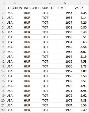
In my example, I’ve downloaded historical unemployment numbers by country. And rather than putting that data all into one sheet, I’ve created multiple tabs for countries. Not all of them, but just a few that I want to do lookups on:
Each tab is named after the country abbreviation in the data to make it easy to know what’s in each sheet. And inside each sheet is data that is formatted in the same way:
Creating the formula
If I just wanted to lookup the value for the United States’ unemployment rate from 1955, my formula would look as follows:
=VLOOKUP(1955,USA!D:E,2,FALSE)
I could replace 1955 with a cell reference. But other than that, this is in essence what the formula in its simplest form would look like. I’m looking up the USA tab as indicated by the ! symbol that comes after the sheet name. You don’t actually need to enter the ! mark. You can just type in the formula and then when you get to the lookup range, jump over to that tab and select your range — Excel will automatically add the exclamation mark for you.
While this formula works, it isn’t versatile. If I wanted to look up a different tab, I would need to change the reference, since it is hardcoded.
Making the formula dynamic
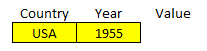
I have created named ranges for the country and year values:
What I want to be able to do is change any one of them and for my lookup formula to extract the correct value. The key to making this work is by including the INDIRECT function. With that, I can reference the specific range I need and use a dynamic tab name. Inside the INDIRECT function, I can concatenate the country value with the range:
INDIRECT(Country&”!D:E”)
But this on its own only specifies a range. I need to include it in the lookup formula for it to work:
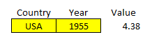
=VLOOKUP(Year,INDIRECT(Country&”!D:E”),2,FALSE)
‘Year’ and ‘Country’ are the named ranges that I have used above. The key thing to remember is the exclamation mark that comes afterward and the range. By doing this, now I can change my formula to automatically pull from the correct tab while also looking up the year. It avoids me having to change the formula manually every time I want to use different tabs. It returns the same value as if I were to enter it myself:
If you liked this post on How to Use VLOOKUP With Multiple Sheets, please give this site a like on Facebook and also be sure to check out some of the many templates that we have available for download. You can also follow us on Twitter and YouTube.
In this post, I’ll show you how you can calculate stock returns using Google Sheets. However, you can use a similar approach in Excel by using the STOCKHISTORYFUNCTION.
First thing’s first — let’s pull in the historical data
For this example, I’m going to pull in the S&P 500’s historical values to see how the index has performed both in the past 12 months and over the course of several years.
To do that in Google Sheets, I’m going to use the GOOGLEFINANCE function which allows me to pull in historical prices. To get the values from the S&P 500, the ticker symbol I’m going to use is ‘.INX’ and to get the last year of data, I’m going to set my start date equal to TODAY()-365 and my end date will be TODAY(). Here’s the full formula:
Once you’ve got the data loaded, then what you’ll want to do is enter the dates that you need values for. In this example, I’m going to use the last day of every month. For this, I can use the EOMONTH function. It takes two arguments: the start_date and the number of months. If I want the current month-end date, then I just set the second argument (months) to zero. As for start date, that can just be any date that falls within the month, which I can enclose within a DATE function. Here’s how the formula would look if I want the last day of September 2021:
=EOMONTH(date(2021,9,1),0)
But since I need to adjust this so that I can copy the formula down and have it automatically adjust, I am going to use the ROW function, which will return the current row number. Since I want the values to be increasingly negative as I copy down the formula (e.g. the current month should be 0, the following one -1, then -2, and so on), I will multiply this by a factor of negative 1 and add 1 to the total (to ensure the first value start at zero):
ROW(A1)*-1+1
That replaces the zero value from the earlier formula:
=EOMONTH(date(2021,9,1),ROW(A1)*-1+1)
And now, I can easily copy this formula down and my month-end dates will populate without requiring me to make any manual adjustments along the way:
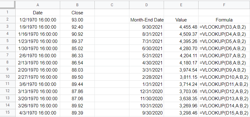
Next, I’ll do a lookup to get the values. And that’s as simple as a VLOOKUP on my dates, which are in column A with the corresponding values in column B. If you use weekly dates, then be careful not to set the last argument in the VLOOKUP function to false because you’ll end up with errors as the weekly values won’t always fall neatly on the end of the month. Instead, leave the last argument blank or set it to TRUE so that it finds the closest match. Here’s what that looks like:
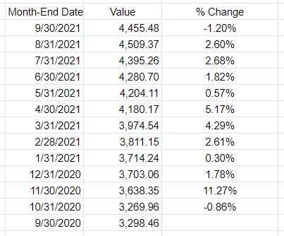
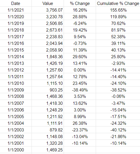
All that’s left at this point is to now just calculate the change in value. I can take the new value, divide it by the previous period’s value, and subtract one from it. This will give me a percent change:
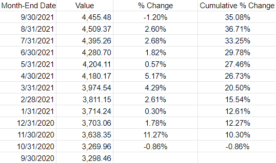
If I wanted to determine the cumulative % change since my first month-end date, then the old value would always remain the same — it would be the first date in the series. By freezing that cell, I can calculate the cumulative % change:
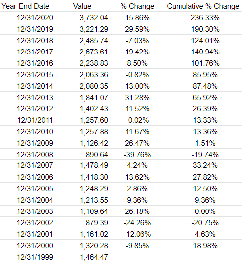
If you wanted to pull in the returns by year, you can do the same thing. All that changes is that instead of pulling in the month-end dates you will use the year-end dates. The main difference here is in calculating the different dates. Rather than multiplying by a factor of -1, you’ll need to use -12. And the starting date should be Dec. 1. Here’s how my formula looks like:
=EOMONTH(date(2020,12,1),ROW(A1)*-12+12)
And when I copy that down, it will automatically adjust for each previous year:
The one thing you may notice in Google Sheets is that the GOOGLEFINANCE function returns a timestamp for the date. Each day ends at 16:00:00. This can create some unintended results. For example, using the VLOOKUP function, if I use the date 12/31/2020, because it looks for an approximate match, it will actually return the value from 12/30/2020. Unless you add the timestamp, an exact match won’t work. And since a date with no time will by default by 0:00, the lookup of 12/31/2020 16:00:00 won’t be a match. One way to get around this is just to use a different date. Rather than using the EMONTH function, I can just adjust the date by reducing the year by 1. This is the formula I can use if instead I want to get the first day of the year:
=DATE(2021-ROW(A1)+1,1,1)
Using the ROW function again can allow me to automatically adjust the year. Here is the updated table:
If you liked this post on Using Tags in Excel, please give this site a like on Facebook and also be sure to check out some of the many templates that we have available for download. You can also follow us on Twitter and YouTube.
Did you know that you can group numbers in Excel using tags? By just listing all the categories an item should belong to, you can make it easier to group them. In this post, I’ll show you how you can use tags in Excel to efficiently summarize different categories.
Creating tags
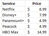
Suppose you wanted to list all the possible streaming services you might subscribe to. You might have a list that looks something like this:
This is fine if you want to compare them or even tally them all up. But what if you wanted to look at different scenarios, such as what if you select some of these services, but not all of them? This is where tags can be really helpful. Let’s say I want to create the following categories:
Basic
Kids
Tier 1
Tier 2
Tier 3
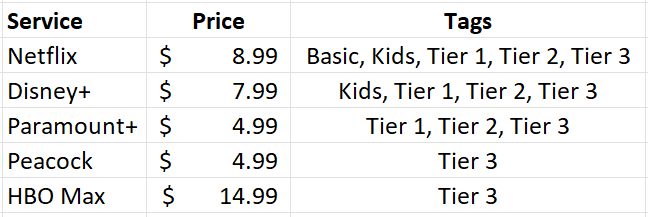
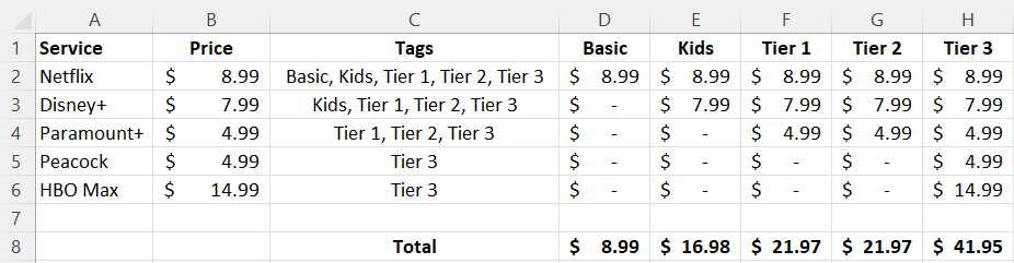
Each category will have a different mix of services. Here’s how I can use tags to make that happen. I’ll create another column next to the price where I specify all the categories a service will fall under:
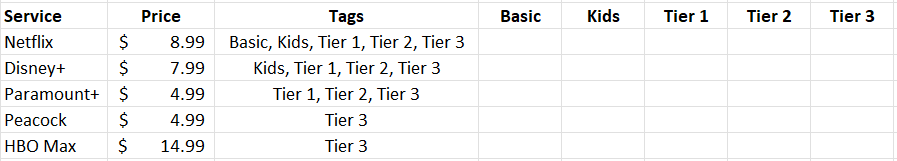
In the above example, Netflix is included in every package but HBO Max is only included in Tier 3. Next, what I’m going to do is create columns for each one of these tags, such as follows:
Without using tags, you might be tempted to put a checkmark to determine which service belongs in which category. But that’s not necessary here. Instead, I’m going to use a function to determine whether to pull in the price or not.
Using a formula to determine if a tag is found
The key to making this work is the SEARCH function. This will look within the tag values to see if there is a match. If there is, then the price will be populated within the corresponding category. To check if the ‘basic’ keyword is found within the tags related to Netflix (assume this is cell C2), this is how that formula would look:
=SEARCH(“basic”,C2,1)
This will return a value of 1, indicating that the term is found at the very start of the string. If you use the function to look for the word ‘kids’ then it would return a value of 8 as that comes after ‘basic in my example.’ Of key importance here is that there is a number. If there isn’t a number and instead there is an error, that means that the tag wasn’t found. I will adjust the formula as follows to check if there is a number:
=ISNUMBER(SEARCH(“basic”,C2,1))
This will return a value of either TRUE or FALSE. But the formula needs to go further than just identifying if the tag was found. It needs to pull in the corresponding value. To do this, I’ll need an IF statement to extract the value from column B:
=IF(ISNUMBER(SEARCH(“basic”,C2,1)),B2,0)
By freezing the formulas and copying this across the other categories, this formula will now allow me to pull in the amounts correctly based on the tags:
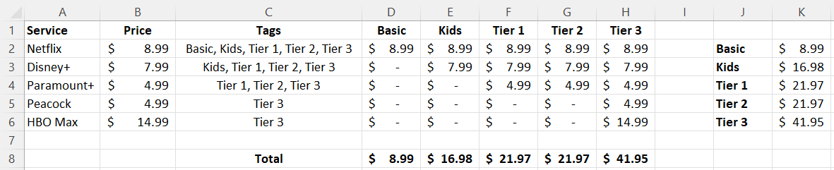
But let’s say you don’t even want to do this, you just want to quickly group the totals without these extra columns. You can also do that with the help of tags.
Summarizing the totals by category
You don’t need to create a column for each group if you don’t want to. You summarize the total in just an array formula. Simply use the formula referenced earlier and include it within a SUM function, while referencing the entire range:
This is the same logic as before, except this time the values will be totaled together. On older versions of Excel, you may need to use CTRL+SHIFT+ENTER after entering this formula for it to correctly compute as an array. But if you’re using a newer version, you don’t need to. If you copy the formula to the other categories, you’ll be able to sum the values by without the need for additional columns:
If you liked this post on Using Tags in Excel, please give this site a like on Facebook and also be sure to check out some of the many templates that we have available for download. You can also follow us on Twitter and YouTube.
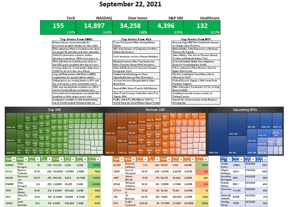
Want to create a dashboard to track the stock market and the latest business-related news? Below, I’ll show you how you can create a stock market dashboard using Excel and Google Sheets to pull in all the data you’ll need. If you’d prefer to just download the file, you can do so here.
Step 1: Compiling the data
You can get stock prices into Excel using the STOCKHISTORY function. However, that isn’t available on older versions of Excel and it also doesn’t pull in the current day’s prices. Using Google Sheets can be more effective for this purpose. Plus, on there, I can pull in business-related news as well.
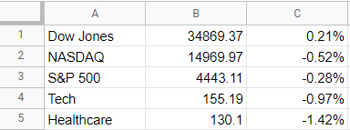
To start, I’m going to pull in values for the Dow Jones, Nasdaq, and S&P 500. I’ll also download the values of a couple of exchange-traded funds (ETFs) that track healthcare and tech stocks. To get the latest price, you can use the built-in GOOGLEFINANCE function that’s only available on Google Sheets. To get the latest value of the Dow Jones, the following formula will work:
=GOOGLEFINANCE(“.DJI”,”price”)
And to calculate the percentage change:
=GOOGLEFINANCE(“.DJI”,”changepct”)/100
For the Nasdaq, you’ll use “.IXIC” and for the S&P 500 the ticker is “.INX”
For the ETFs, since they aren’t indexes, there is no period beforehand and I reference XLK for tech and XLV for healthcare. In my Google Sheets file, I have a simple layout for the values and their changes that I will later pull into Power Query:
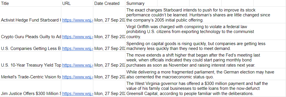
Next, I’ll also download the latest business-related news. Google Sheets has another unique function for this: IMPORTFEED. All you need to do is find an rss feed from a website that you want to pull information from. Not every website has an rss feed but what you can do is just do a Google search for the name of a source and ‘rss’ to see if you can find a link. There are three sources I’m going to use for this dashboard:
In Google Sheets, the top articles from each of those rss feeds will show up, including the title, URL, date created, and even a brief summary:
Now, it’s time to pull all this data into Excel.
Step 2: Loading the data into Excel using Power Query
To import data from Google Sheets into Excel, you need to first share the sheet. While in Google Sheets, go into File -> Share -> Publish to web. Then, you’ll be prompted to select what you want to share. I’ll start with the Markets tab I created and then the News tab:
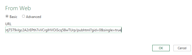
Copy this URL as you’ll need it to load the data into Power Query. While you’re back in Excel, go under the Data tab and click on the From Web button under the Get & Transform Data section. You’ll be prompted to enter a URL. This is where you’ll paste the link that you copied from Google Sheets:
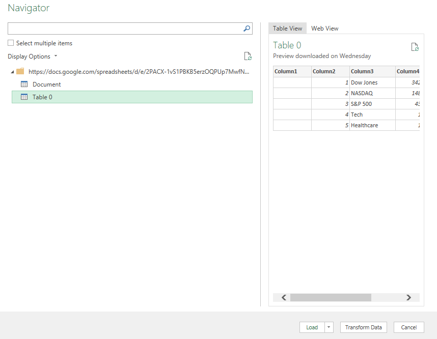
On the next page, select Table 0 as where you want to extract data from. And if you want to do some cleanup (getting rid of extra columns), you can do so by clicking on the Transform Data button:
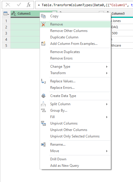
To remove any unneeded columns in Power Query, just right-click on a column header and click Remove:
Once you’re done, click on the button to Close & Load if you want the data to be loaded on a new sheet. If you want to control where it gets pasted, then use the drop down and select Close & Load To.
Repeat these steps for the other Google Sheets tab.
In addition, I’m also going to load data from a few other sources:
Top 100 Gainers on Yahoo Finance: https://finance.yahoo.com/gainers/?offset=0&count=100
Top 100 Losers on Yahoo Finance: https://finance.yahoo.com/losers?offset=0&count=100
Upcoming IPOs from IPOScoop: https://www.iposcoop.com/ipo-calendar/
The process for importing these links into the dashboard is the same as for Google Sheets. Go through Power Query, import from web, and paste in the URL plus make any formatting changes necessary. The next step involves putting all this data together in a dashboard.
Step 3: Creating the dashboard
In my spreadsheet, I’ve created two tabs: one that hold all my Power Query downloads (the ‘Data’ tab) and a ‘Dashboard’ tab for where all the information will be displayed.
To make the set up of the dashboard easy to manage, I’m going to change the column width to 10 for everything. To do that, press CTRL+A to select all the cells on the Dashboard tab, then right-click on any of the headers, and there you’ll be able to select column width.
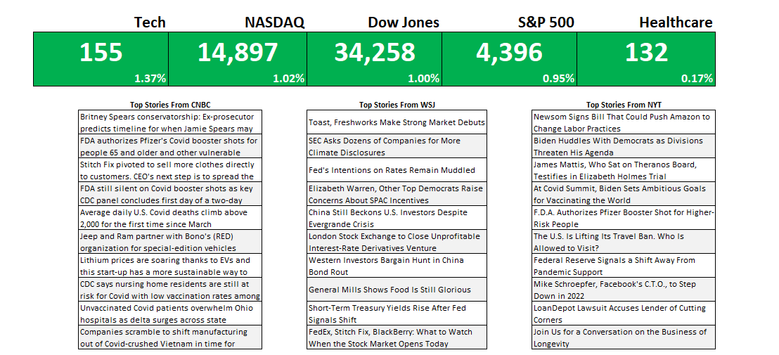
First up, I’m going to get the indexes and market indicators as a starting point. To do this, all I need to do is link to the values and the percentages for the S&P 500, Dow Jones, Nasdaq, Tech, and Healthcare tickers I imported from Google Sheets. By default, I’ll set the formatting for all the cells to be green:
To make this more dynamic, I will add some conditional formatting so that if the percentage change is negative, the corresponding cells will highlight in red. For this, I can select all the cells in green above and create a conditional formatting rule the starts with where the first percentage is (in my spreadsheet, it is cell E6):
=E$6<0
This is a simple rule but by not freezing the column (E) and freezing only the row (6), it can be applied to all the cells above. I can apply a red background color so that if any of the percentages are negative, the cells will highlight accordingly:
For the next part of the dashboard, I will copy over the news stories that were also downloaded from Google Sheets. This time, I’m going to use the HYPERLINK function so that I can not just link to the title but also create a clickable link that will allow me to open the story should I want to open it in my default browser. The function itself is simple and involves just two arguments, one for the actual URL and another for what the text should show up. Since it’s shorter, I’m going with the title. After applying some formatting and copying all three sources, this is what my dashboard looks like:
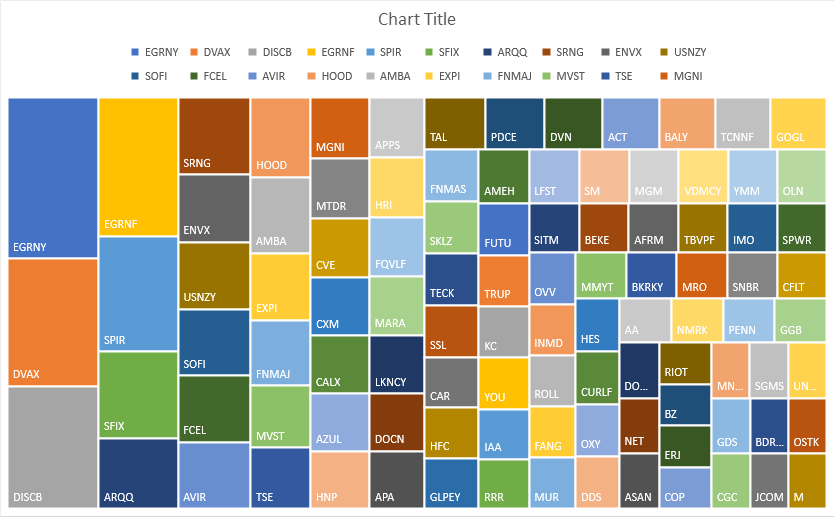
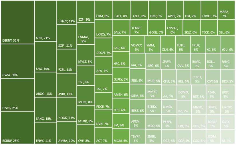
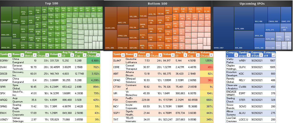
For the last part of the dashboard, I’m going to pull in the tables from the other data sources (top 100 gainers, losers, and upcoming IPOs). If these are on the Data tab, you can just cut and paste them onto the Dashboard tab. And for each one of the tables, I’m going to create a chart based on the symbol and the percent change.
To do this, select the Symbol column and the % Change columns. Then under the Insert tab in Excel, open up the charts and select Treemap. If you selected too many columns or didn’t specify which ones you wanted, you might get a different look. But if you only selected those two, you should see something like this:
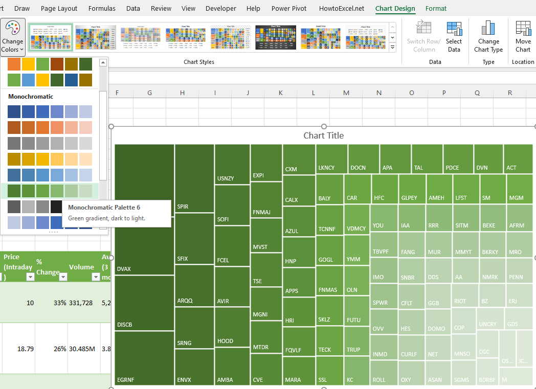
Since the chart includes the symbols, the legend can be deleted. Also, I’m going to change the color scheme so that it goes from dark green to light green. This change can be made by clicking the Change Colors button next to the chart:
To add the percentage to each of the boxes, right-click on one of the ticker symbols and click Format Labels. Then, check off the box for value so that the percentages will also show up next to the symbols:
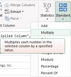
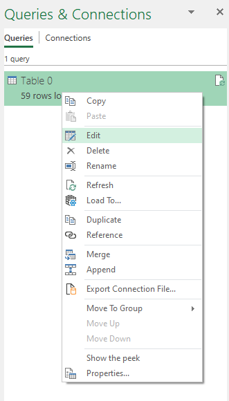
These steps can be repeated for the other charts. However, for the losers table, since the percentage change is negative, it needs to be flipped to positive first. To do that, that query needs to be edited. If you click on Queries & Connections section under the Data tab, you’ll see a list of all your queries. Click on the one that takes you to the top losers query. Right-click edit and Power Query will open up.
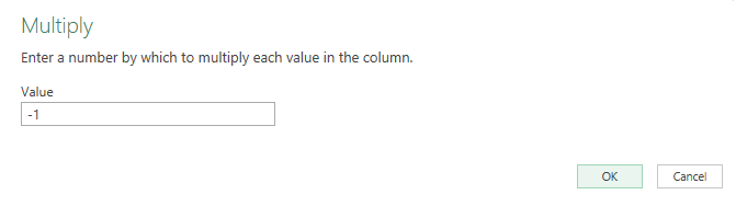
Once in Power Query, select the % Change column and under the Transform column at the top, click on the Standard drop down, which will show you all the different calculations you can apply:
Click on Multiply and then for the value in the next box, enter -1. Pressing OK will then flip all the values to negatives.
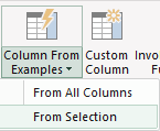
Now, you can create the same Treemap chart for this table. For the IPOScoop download, the field I’m going to use is Est. $ Volume. This query will also need to be edited in order to use that field since it is text. Although it is a bit more complex since this field contains text and dollar signs, there’s a relatively easy way to parse out what you need.
In Power Query, select the column, and under the Add Column tab, click on the Column From Examples button (choose the option for From Selection):
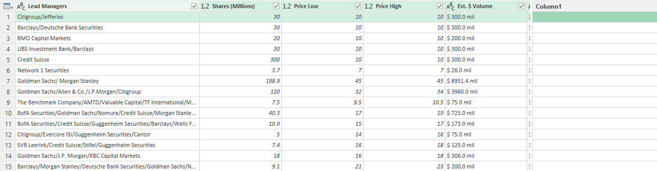
That will create a new column:
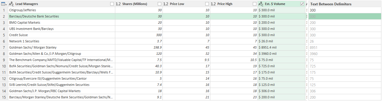
In Column1, I can enter the value that I want Power Query to extract. If I just enter a few values to show what I want (in this case, I only need to enter 300), Power Query fills in the rest, figuring out what I am trying to do. It’s an easy way to parse data in Power Query.
After creating the new column, I can change the format from text to currency by clicking on the ‘abc’ letters in the title:
Now that I have the column created, I can remove the original one and load the data back into Excel and proceed with making a Treemap for this chart using the symbol and the newly created column.
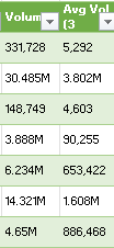
The last thing I’m going to do is create a new column to show the change in volume to determine how much more (or less) trading there was for each stock on the day compared to the average. This will compare the average three-month volume with the current day’s volume. The one complication is that some of the values contain letters:
To convert these values, it’s important to first parse out the letters. If a value doesn’t contain a letter, then it is in thousands. I’m going to set everything to millions. So if the value doesn’t contain a letter, it will be multiplied by 0.000001 to convert it into a fraction of a million. And if it contains a ‘B’, it will multiply by a factor of 1,000. Otherwise, the value will remain as is. Here’s how the first part of the formula will look like, which involves determining the multiplication factor:
Since the letter is always at the end of the string, just using the RIGHT function (which looks at the right-most string) will suffice. This result needs to be multiplied by the remaining value. That value can be extracted by using the SUBSTITUTE function which will replace one value with another:
SUBSTITUTE([@Volume],”B”,””)
In the above formula, the value of B will be replaced with an empty string. This is the same as simply removing the value. To ensure that any ‘M’s are also removed, I will embed this formula within another one that will substitute out those values:
SUBSTITUTE(SUBSTITUTE([@Volume],”B”,””),”M”,””)
I multiply this by the first part of the formula, and my numerator is as follows:
For the denominator, I’m going to use the exact same formula, except instead of the current volume, I’m going to use the field for the three-month average:
The -1 at the end is to put the change in a percentage of less than 100%.
Another step you might consider at this point to help identify these changes is to format these numbers so they are easier to read. You can use conditional formatting (color scales) to easily highlight the highs and lows. And if you want to format the percentages so that they show commas and negative percentages show up red, use the following in the custom number format:
#,##0%;[Red]#,##0%
The semi-colon before the [Red] separates out what the percentages should look like when they are positive (the part before the semi-colon) and what they should like when negative (the part that comes afterward). The [Red] text indicates the value should be in red text.
Here’s how this section looks as part of my dashboard:
And here’s a snapshot of the dashboard as a whole.
One thing to remember: if you want to update the queries and the dashboard, make sure you go under the Data tab and click the Refresh All button. Otherwise, your data may not be up to date.
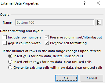
Also, to prevent your tables from stretching out when updating the queries, select each one of them and under the Table Design tab, click the Properties button (under the External Table Data section), where you should see this:
Make sure the Adjust column width checkbox is unticked. This will prevent your columns from stretching out and disrupting your layout.
If you liked this post on Creating a Stock Market Dashboard in Excel, please give this site a like on Facebook and also be sure to check out some of the many templates that we have available for download. You can also follow us on Twitter and YouTube.
When you create a formula in Excel, your goal should always be to minimize how much you hardcode of it. By doing that, you can make your formula more dynamic and easy to update, without having to change it. Below, I’m going to show you can create dynamic formulas in Excel, using a combination of INDEX & MATCH as an example.
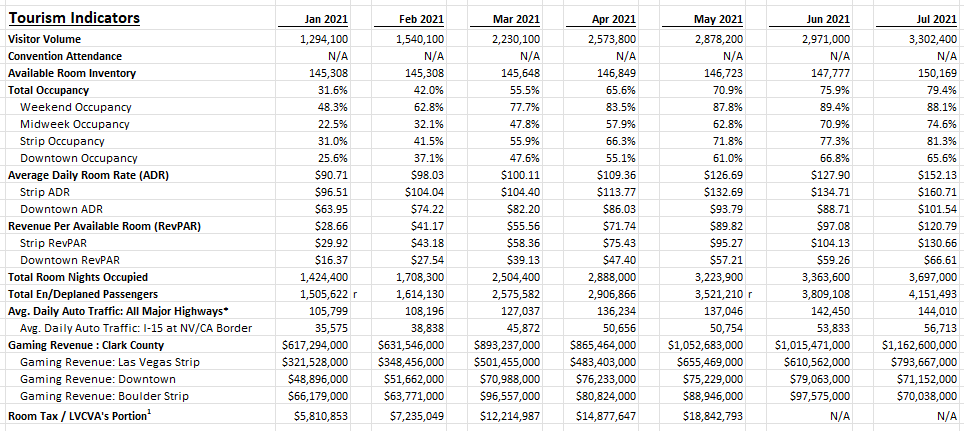
For this, I’m going to use Las Vegas visitor statistics. The goal is going to be to pull in certain values based on the combination of field and month. Here’s how the Excel download looks like to start with:
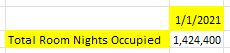
If I wanted to use lookup the visitor volume for a given month, I could use the following formula (assume the data above is in columns A:N):
=INDEX(B:B,MATCH(“Visitor Volume”,A:A,0),1)
Column B is where the January data is. And in column A, where the fields are, I’m searching for ‘Visitor Volume’. My formula returns a value of 1,294,100. That is the correct result. However, the way the formula is set up right now isn’t flexible; I hardcoded the field I was looking for and I also indicated which column I wanted to pull the results from. Ideally, I should be able to have the field set up to be dynamic, and the date as well.
Using a named range for the field
I’ll begin by making the field dynamic. Rather than type in ‘Visitor Volume’, I can just reference a named range, as such:
In the above example, I entered the field I wanted to lookup and created a named range for it, called ‘lookupfield’. Now, I can just reference the lookupfield. And if I change its value to another field, it will return a different value, all without needing to change the formula itself:
The only thing that changed here was the value I was looking up.
Using a named range for the month
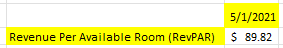
Next up, I’ll adjust the formula so that the month I’ll return values from is also dynamic. This part is a bit trickier because I need to actually move the entire column. In the current formula, I’m referencing column B (which relates to the January values). But if I want to get the values for February, then it needs to change to column D, and to column F if I want March’s data, and so on.
Using the OFFSET function can be useful here. Rather than picking a specific range, I just start with the first column (A). The second argument in the OFFSET function pertains to the number of rows to move. Since I don’t want to my move my range up or down, I leave this as 0. The next argument is the number of columns I want to move. This is going to depend on where the month value is. Here again, I’ll create a named range. This time, I’ll call it ‘lookupmonth’, where I will specify the month I want to look at. In this spreadsheet, the months are just the first days of the month (e.g. Jan 2021 is 1/1/2021). I will need to use the MATCH function again, this time searching for this value within the row that contains the months (this is row 7 in my Excel sheet). Here’s what my formula will look like, fully dynamic:
I add the -1 at the end of the columns argument because I’m already starting at the first column and it should be removed from the number of columns I want to move to the right. Here’s how the formula looks like with the two named ranges (highlighted in yellow):
Now, I can change both the field and the month, and my formula will automatically update:
The important thing to note here is that the named ranges need to be exact matches for the MATCH functions to work properly. Even an extra space will result in the formula not returning the correct value. One thing you may want to consider is creating a drop-down list for the available options to prevent the chance of someone making a typo and entering an invalid option.
If you liked this post on Creating Dynamic Formulas With Index & Match, please give this site a like on Facebook and also be sure to check out some of the many templates that we have available for download. You can also follow us on Twitter and YouTube.
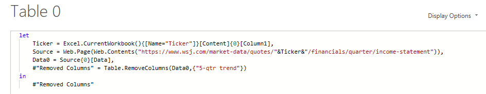
In this post, I’ll show you how you can import a company’s financial statements into Excel using Power Query. Previously, I’ve covered how to get stock prices from both Yahoo Finance and Google Sheets. But to get financial statement information, I’m going to use a different source: wsj.com. The reason being, is it’s in an easy format to export and that makes the import process very easy for Power Query.
Downloading the data
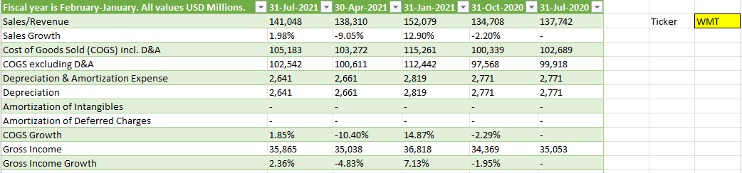
I’m going to use Walmart’s financials for this example. And if you navigate to the following URL, you will get a summary of Walmart’s quarterly financial statements:
What’s convenient about this URL is that it contains both the ticker, the statement type, and indicates that the financials are quarterly. That makes it easy to alter in case you wanted to look for annual statements or a balance sheet rather than an income statement. Just changing the URL will get you to the right page. The above link is what I’m going to use for this example.
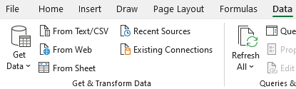
To load the data into Power Query, go to the Data tab and click on From Web:
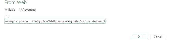
Then, paste the URL in the following box:
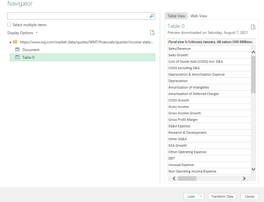
After clicking OK, you can select which table to import. In this case, it’s going to be Table 0:
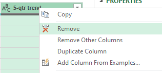
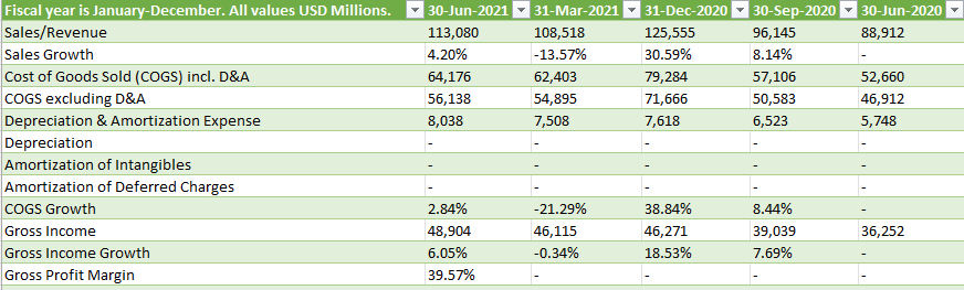
Next, press the Transform Data button to make changes before it gets imported. I’ll start with removing the column at the very end, showing the trend, as it doesn’t contain any information. To remove it, right-click on the header and click Remove:
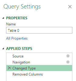
I’m also going to remove the Changed Type step, which automatically changes the data types. To get rid of the step, click on the X next to the step:
This is important because since the header names change based on the quarter, it isn’t going to be helpful to have this step since it looks for hardcoded values. An optional step you could take is to Demote Headers so that the header names are generic and not tied to a specific quarter. However, this isn’t necessary if you remove the Changed Type step. For more information on changing header names, refer to this post.
Once you’re done making changes, click on Close & Load in the top-left corner, and then your data will load into a sheet.
The download will work just fine right now. However, let’s also make the file a bit more versatile in case you want to quickly change the ticker symbol.
Setting up the variables
First up, I’ll create a named range for the ticker symbol, called ‘Ticker’ :
I’ll now go back into the query editor to account for this named range. To edit a query, go into the Data tab, click on Queries and Connections, and then off to the right you should see your queries. Right-click edit on the one you want to adjust:
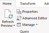
Then, click on the Advanced Editor button near the top of the Power Query window:
I’m going to add the Ticker variable under the let section as follows:
Note that Power Query is case-sensitive and you will get an error if what you’ve entered doesn’t match exactly what you’ve set as your named range. Also, make sure to add a comma at the end.
I will also need to adjust the Source variable so that it uses the Ticker variable:
The key thing here is to break up the part of the URL that mentions WMT and replace it with the named range. Here’s what the code looks like within the Advanced Editor:
Now, you can Close & Load back into the worksheet. To test the named range, what you can do is replace the ticker value from WMT to AMZN, and if it works correctly, it should load Amazon’s income statement instead. After changing the ticker symbol, remember to press the Refresh All button under the Data tab:
If it works, you should see a whole new set of data populate on your spreadsheet:
If you liked this post on How to Import Financial Statements Using Power Query, please give this site a like on Facebook and also be sure to check out some of the many templates that we have available for download. You can also follow us on Twitter and YouTube.
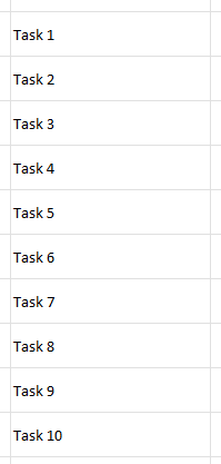
There are many different apps to choose from if you want to create a checklist. But if you’re doing Excel work and have tasks associated with it, it may be easier to just include the checklist right within your spreadsheet. In this post, I’ll show you how you can make a checklist in Excel quickly and easily that you can re-use in many spreadsheets.
Step 1: Creating your list
Excel is an easy place to create a list since a spreadsheet is already in a grid format. You can use either numbers or letters as prefixes, or without anything at all:
Step 2: Add checkboxes
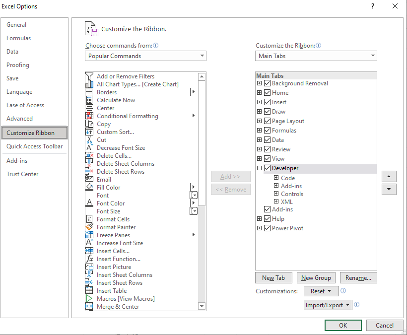
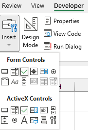
In order for this to look like a task list, we should add some checkboxes. If you don’t have the Developer tab enabled in Excel, make sure to do so. Under Excel Options, you’ll have an option to customize the Ribbon. This is where you can select which tabs you want to have enabled:
Once enabled, go to the Developer tab and click on the Insert button. Select the checkbox icon that is under the Form Controls section:
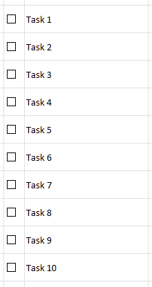
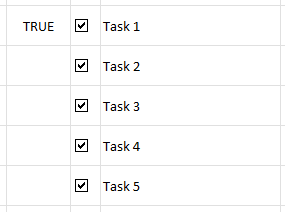
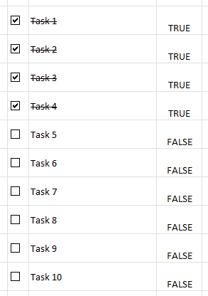
Then, use the mouse to drag and create a checkbox. It will automatically create some generic text to say ‘Check Box 1’ — you can remove this as it is unnecessary. Once you’ve got the checkbox in the position you want (and within its own cell), copy the entire cell and paste it over so that you have a checkbox next to each task:
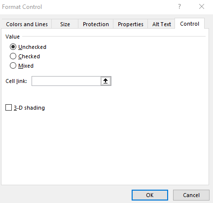
Each checkbox can be linked to a specific cell. And every time you click the checkbox, the value of that cell will toggle between TRUE and FALSE, to indicate if the box is ticked or not. To create a link, right-click on a checkbox and select Format Control. Then, under the Control section, select a cell in the Cell Link section:
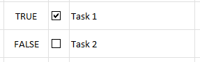
Then, when the checkbox is ticked or unticked, here’s how the values in the will appear in the linked cell:
The danger with copying these checkboxes after you have linked a cell, is that those cell links won’t change; multiple checkboxes will be linked to the same cell:
To correct this, you will need to modify the cell link for each checkbox. Once that’s done, it’s time to move on to the last step.
Step 3: Add conditional formatting
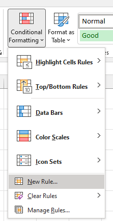
Right now, ticking the checkbox doesn’t do anything but show a TRUE or FALSE value. In this step, I’m going to add some conditional formatting to also cross out the item. To do this, I’m going to highlight the column that has the tasks (column B) and create some conditional formatting rules:
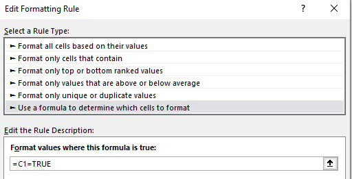
I’m going to create a rule that looks at the column that contains the cell link values (column C). It will check if the value is set to TRUE using the following formula:
=C1=TRUE
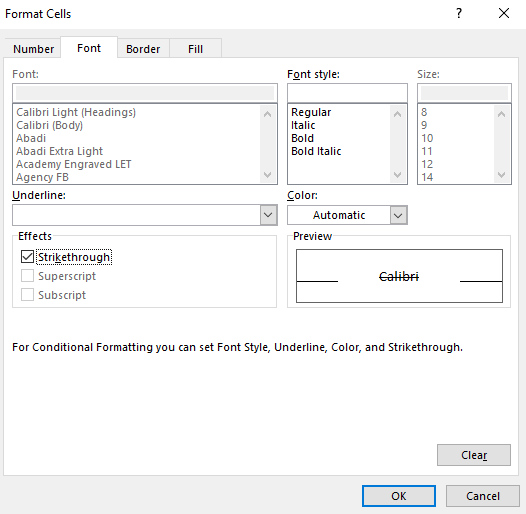
Then, under the Format options, I will apply a strikethrough effect:
Now, when a checkbox is ticked, the text will have a strikethrough effect:
The TRUE/FALSE values can be hidden since they don’t need to be visible in order for the checkboxes and strikethrough effects to work. The only other changes you may want to make at this point relate to formatting. This includes applying a header. Here’s what your finished checklist might look like with some additional formatting:
If you liked this post on How to Make a Checklist in Excel, please give this site a like on Facebook and also be sure to check out some of the many templates that we have available for download. You can also follow us on Twitter and YouTube.
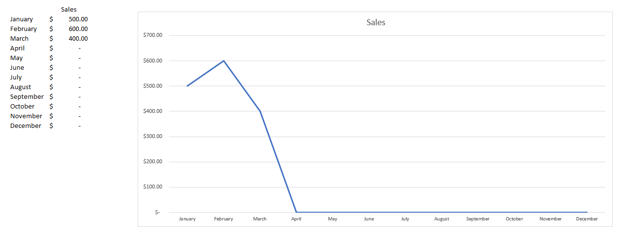
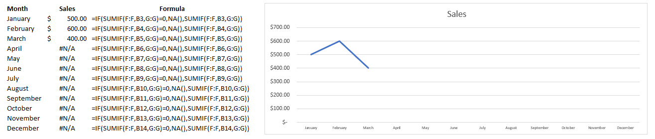
If you have values that you are plotting on a chart and some of them are zeroes, you will likely notice your chart sliding all the way down to the bottom. It can be problematic when you are entering in year-to-date data which will inevitably lead to blank or zero values. That’s why in this post, I’ll show you how to hide zero values from showing up on a chart in Excel.
Let’s start with the following example:
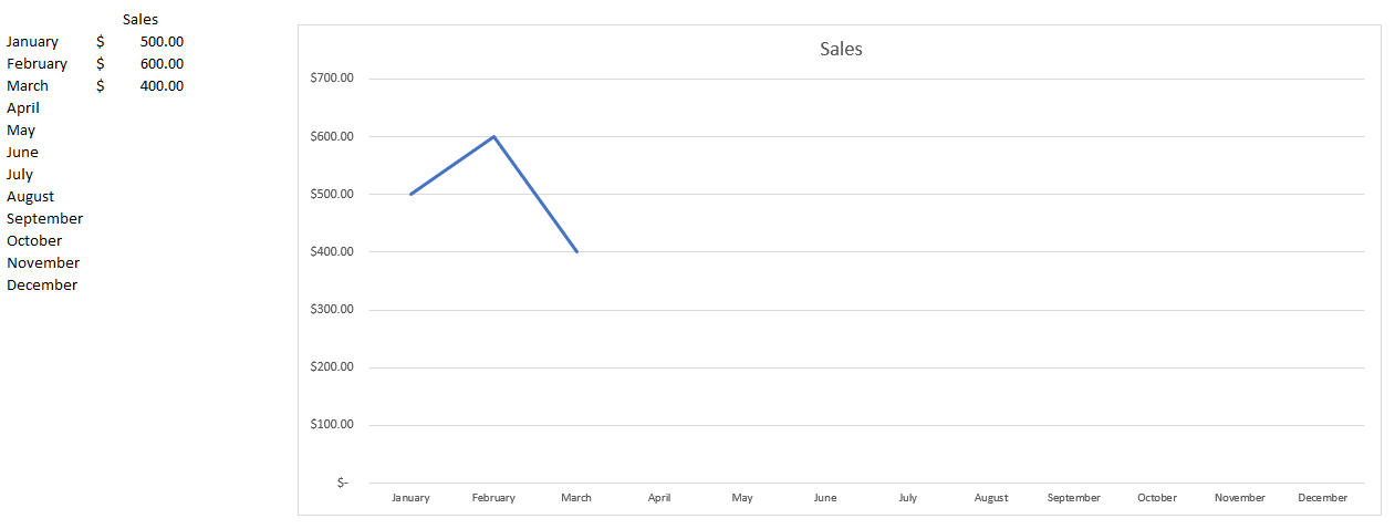
In this case, we have values for just a few months. From April through to December, the values aren’t necessarily zero — we just don’t have data yet. But the problem is that on the chart, the line graph shows them as being zeroes. If we were to get rid of those zero values, it would fix the issue:
But the problem is that this may not be a convenient solution. If you want to create formulas to calculate the totals for each month, going back and deleting the ones with no values and remembering to put the formulas back in for future months isn’t going to be a very convenient option. There is a way that the calculations can be adjusted so that you can still get the zero values not to show.
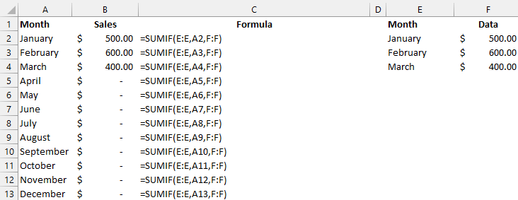
Let’s suppose you have a SUMIF calculation for each month which looks as follows:
One way to fix this issue is to add an IF statement to avoid the zero values. But returning a blank value won’t fix the issue. Instead, what we’ll want to do is return an #N/A value. To do that, you just need to use the following formula:
=NA()
That just needs to be incorporated into the formula to say that if the sum is equal to 0, an NA value is returned:
=IF(SUMIF(E:E,A3,F:F)=0,NA(),SUMIF(E:E,A3,F:F))
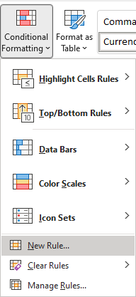
Although this solves the problem, it creates a bit of an eyesore with the #N/A values showing up in our data set. If you want to get rid of that, there’s a solution for that as well. Using conditional formatting, we can adjust the values so that any #N/A values show up blank. To do this, I’ll select column B and under the Conditional Formatting in the Home tab, select the option for a New Rule:
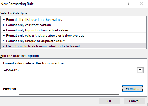
Select the option to Use a formula to determine which cells to format and enter the following:
=ISNA(B1)
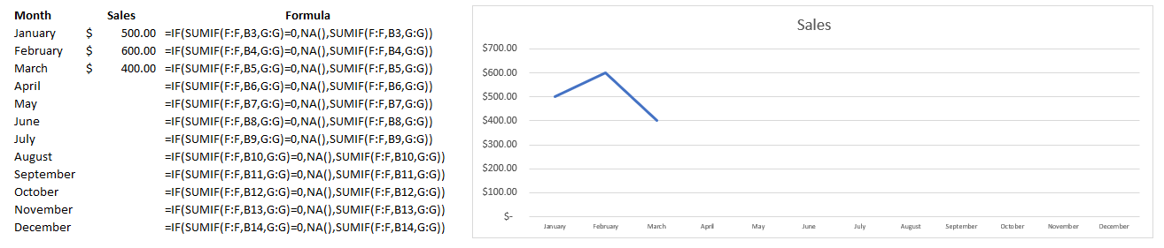
I need to use B1 since that is the start of the range that I have selected. Next, you can just click on the Format button and set the font color to white so that the #N/A values don’t show up. This is what my sheet and chart looks like after applying the formatting:
If you liked this post on How to Hide Zero Values on an Excel Chart, please give this site a like on Facebook and also be sure to check out some of the many templates that we have available for download. You can also follow us on Twitter and YouTube.
In a previous post, I showed how to get stock prices using Power Query. This time around, I’m going to show you how we can do the same for foreign exchange rates, pulling that data into Excel. For this example, I am going to use the currency conversion site xe.com.
Creating the connection
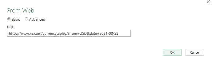
The first thing that we need to do when creating a Power Query connection is determining which web page the data will come from. On the xe.com website, there is a currency table for each day. If I wanted to pull the USD foreign exchange rates into Excel as of August 22, the URL I would use is as follows:
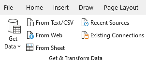
The link is convenient because I can easily alter the currency and the date. I’ll go over how to do that later but first, let’s create the connection. To do that, go in the Data tab on the Ribbon and click on From Web button under the Get & Transform Data section:
Then, on the next screen, I’ll paste the link and click OK:
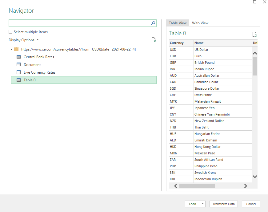
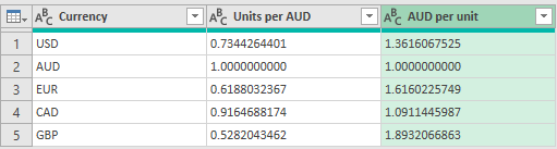
Once it has loaded, there will be multiple tables to choose from. Table 0 is the one that has the exchange rates:
Instead of clicking to load the data, click on Transform Data to make any adjustments to it before it loads into Excel.
Adjusting the query
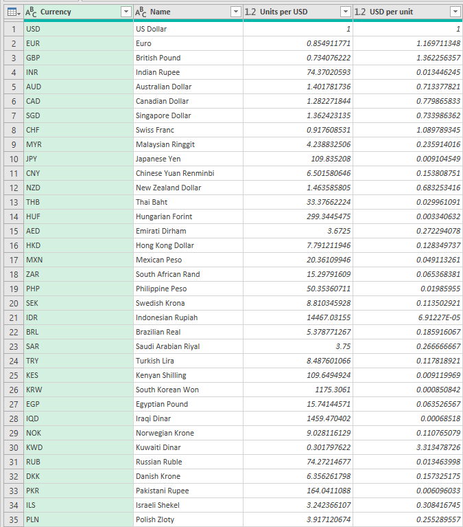
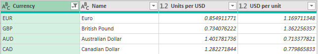
Once the query is loaded, you’ll see the following window:
You probably don’t need or want to see all these rows in Excel. So what you can do before loading it is to clean the data up a bit. Let’s say I only want to pull the US exchange rates in Excel for EUR, GBP, CAD, and AUD. To do that, I’ll click on the Currency header and filter for just those options. You can filter the same way you would an Excel table. And once you’re done, you should see the table get a whole lot smaller:
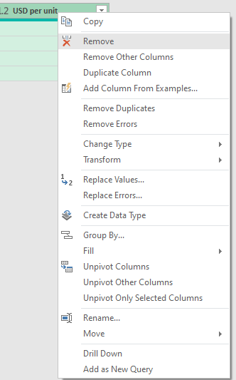
To cut down the table even more, I can remove the Name field since. To remove any column, simply right-click on it and click Remove:
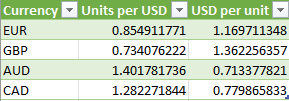
Clicking on the Load & Close button will now populate this into my Excel sheet:
Now, let’s alter the URL so that it can be adjusted dynamically for both the currency and date.
Using variables in the Power Query link
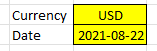
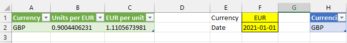
An advantage of using a link that has the currency and the date in it is that it is easy to change. I’m going to start by creating a couple of variables. The first is for the currency, and the second is the date. I’ve set up named ranges of ‘Currency’ and ‘Date’ the following fields:
When entering the date, I’m entering an apostrophe (‘) first so that formatting isn’t an issue and Excel reads the value as text.
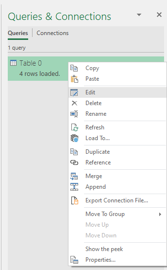
What I’m going to do next is go into Power Query and create these variables. To do so, go back into the Data tab and click on Queries & Connections. Off to the right, you should see your query. Right-click on it and select Edit:
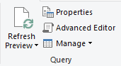
This will open Power Query back up. I’m going to click on Advanced Editor button on the Ribbon, under the Query section:
At the top of the code, I’m going to insert two lines. One for each variable:
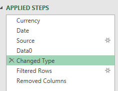
The variables are ready to go. But before using these them, it’s important to remove the Changed Type step from Power Query:
This step looks for exact column names which can cause an error if your names change when downloading data.
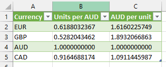
Now with that done, you can change the values and your table will change. Here’s what it looks like if I change the currency to AUD and set the date to July 31:
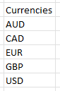
The one problem, however, is that now I have AUD and don’t have USD. What I can do is create a separate table of all the currencies I want to pull in:
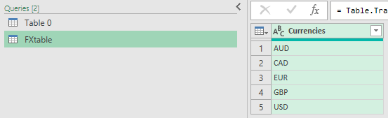
I can load this table into Power Query by going back into the Data tab and this time clicking on the From Sheet option. I’ll rename the FXtable and it shows below the other table:
Now, if I only want to see the values from FXtable, what I will need to do is merge the queries.
Merging queries in Power Query
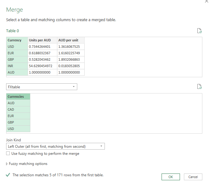
Switch over the Table 0 query and get rid of the Filtered Rows step. Then, on the Home tab, there is an option to Merge Queries in the Combine section that you’ll want to click:
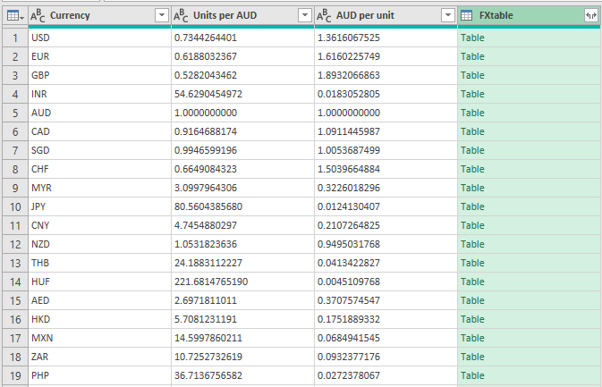
On the next screen, I’ll select the FXtable from the drop down and select the currency fields from each table:
Leave the default of Left Outer selected and then click OK:
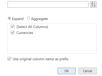
Next, click on the button on the FXtable to expand the table:
Click OK on the next section to expand the only field from that table:
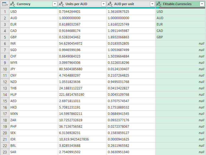
Which will result in this:
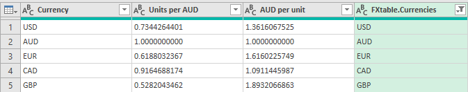
Then, just filter the FXtable.Currencies field so that null values don’t show up, and you’re left with just the currencies that were present on that table:
Now that the table has served its purpose, I can remove the FXtable.Currencies column and I’m back to what I had before:
Now, I can modify the base currency, the date, plus the currencies that I want to show up. Suppose I just want to see the EUR-GBP currency rates for Jan 1, I could enter the following values:
All you need to do is refresh the data from the Data tab and all the queries will update:
And the data matches what comes from the xe.com site:
Are you looking for a way to pull historical data for a currency pair? You can use Yahoo Finance to do that, and the steps for doing that query is similar to how you would pull stock quotes from there (refer to the link at the top of this post).
If you liked this post on How to Pull Foreign Exchange Rates Into Excel Using Power Query, please give this site a like on Facebook and also be sure to check out some of the many templates that we have available for download. You can also follow us on Twitter and YouTube.
It’s time for an updated dashboard post. My original post is now three years old and probably overdue for an update. This time around, I’m going to start from scratch using a real data set from the Bureau of Labor Statistics, where I’ll walk you through my process from start to finish. To follow along, you can download the data I’m going to use from here (I’m going to use the 2020 state data. This is the XLS link).
Preparing the data
If your data is no good, then it won’t matter how great your charts and visuals look. That’s why it’s important to have a look through the data to see how usable it is. And you may not notice any issues until you start populating your charts. But one of the things that are noticeable right of the bat in this data set is that instead of empty values on this sheet, there are # or * signs.
That’s going to be a problem if you want to do any computations on this data. You can use Find and Replace to replace the data with empty values. Note that for the *, you’ll need to find ~* rather than just *, otherwise Excel will interpret the * as a wildcard and find everything.
One other thing that I am going to do is create another column for the occupation titles. In column J, there are more than a dozen titles for the ‘major groups’ (major is indicated in column K). I am going to create a table to group them even further. I’ve put this on a separate lookup sheet:
Now, what I am going to do is insert a column on my main data sheet, after column J, which will do a lookup on this table. The formula will be as follows:
=IF(L2=”major”,VLOOKUP(J2,Sheet1!A:B,2,FALSE),””)
Now, I have a category field in column K for the ‘major’ group classifications:
Next, I’m going to convert the data into a table. To do this, click on any of the cells in your data set, and on the Insert tab, click on Table:
Once done, you should notice some default table formatting gets applied to your data set:
And to make it easy to reference, I’m going to click on the Table Design tab, and under the Table Name section on the left, I’m going to re-name the table to tblData:
To change the name of a table, all you need to do is click on it and make your changes, then press enter.
Creating the pivot tables
For this dashboard, I’m going to create pivot tables and use charts to show the following:
Median salary for the specified position.
Wages by percentile.
Median salary for the specified state based on job categories.
A pie chart showing how many jobs there are by category.
A gauge chart showing how the median salary compares to the national average.
A map chart showing the median wages by state.
Median salary for the specified position
To create this visual, I’m going to create a pivot table from the tblData and put it on a new ‘PT’ tab. For this, I am just going to take the average of the A_MEDIAN column. I will also filter the O_GROUP field so that it only includes the ‘detailed’ group to avoid including the categories. I will also adjust the formatting so that it uses the accounting format. The pivot table itself contains just one value:
I only want this value to show up in a box but what I’m going to do is create a column chart from this. For just the number to be visible, I’m going to add a data label and then remove everything else, including the legend, gridlines, and make the column a clear color. Lastly, I’ll copy my first visual onto a new ‘Dashboard’ tab and put the words ‘Median Salary’ directly above it:
Wages by percentile
Next, I’m going to create a bar chart that shows the wages for a position by the various percentiles that are in the data set. For this, I’m going to grab all the different percentile fields, including the median:
A_PCT10
A_PCT25
A_MEDIAN
A_PCT75
A_PCT90
I’ll need to set these calculations to be averagesjust like on the earlier calculation. I can re-name these to ’10th percentile’, ’25th percentile’, and so on, to make it easier to read. Then, I’m going to create a 3-D bar chart, change the colors, and add some labels so it looks like this:
Median annual wage for the specified state based on job categories
Now, I’m going to create a pivot table and chart to show what the median annual wage is across the different categories I specified earlier for the selected region. This is a simple pivot table set up, all that’s needed is the A_MEDIAN average in the values section of the pivot table, the CATEGORY in the rows, and the O_GROUP to filter just the ‘major’ jobs. This will result in the creation of the following column chart:
A pie chart showing how many jobs there are by category
One of the interesting metrics in the data set is the number of jobs there are per 1,000 jobs in the given region. This is going to be similar to the previous chart, except this time I am going to use the JOBS_1000 field. I’m going to use a pie chart for this visual just to change it up a little bit.
A gauge chart showing how the median salary compares to the national average
I’m going to use a gauge chart to compare the median salary against the national median and how it compares. For detailed steps on how to create a gauge chart, please check out this post. For this visual, I need to create one pivot table just for the national median wage. To do this, I just need to grab the median value and filter the O_GROUP by ‘total.’
For the actual gauge chart, I need to set up a table for the slices and the ranges. I will go with a setup as follows:
The % of completion will take the median value and divide it by the national average. But to avoid it going over 100, I’ll use the MIN formula. And for the ‘high end’ value, I take 200 (think of 100 as the top half of the circle and the other 100 the bottom half) and subtract the % of completion and add the size of the slice. Here is what it looks like when the median salary is greater than the national median:
This is what the gauge chart looks like once it’s been set up following the steps in the previous post:
A map chart showing the median wages by state
Creating a map chart is pretty easy in this situation because we have all the state names and all I need to do here is create a pivot table with the A_MEDIAN value. Here’s what my pivot table looks like:
However, you can’t create a pivot chart directly from a pivot table. But there is a way around that. I’m going to create another table that copies the values from the pivot table. They simply equal the values to the left:
Now, I can create a map chart based on this table:
I now have all of my charts set up:
What’s next is to set up the slicers.
Adding and linking the slicers
I’m going to add two slicers for the dashboard, one for the state and one for the job title.
To insert a slicer, all that’s necessary is to click on any one of the pivot tables and on the Insert tab, click on the Slicer button:
Then, select the fields you want to add. Generally, I add the fields that have the most selections and longest names going down vertically. In this case, that’s the OCC_TITLE field. For the State and Category slicers, I have those going across:
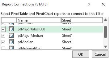
I’ve also added a title just below the slicers to give the dashboard a name. The last piece of the puzzle here is to link the slicers to the pivot tables. Previously, I linked them to all of the tables. But for some of these charts, I don’t want them to link to everything.
For the State and Category slicers, I want them to update everything except the national median pivot table. And for the OCC_TITLE slicer, it should also not update the jobs per 1000 pivot table or the median wage by category. The reason being is that those charts will lose their value if only one job is selected, as the point is they should give an overview of the different categories. Similarly, you could also unlink the state slicer to the map chart.
To manage these connections, you can slicer and select Report Connections:
From there, you can select with pivot tables you want the slicer to link to:
And to keep your slicers from staying in put despite any changes, you can also right-click and select Size and Properties and then select the option to Don’t move or size with cells:
Now, the dashboard is ready to go!
If you liked this post on Making Dashboards in Excel With Map and Gauge Charts, please give this site a like on Facebook and also be sure to check out some of the many templates that we have available for download. You can also follow us on Twitter and YouTube.